Making your SVG accessible includes adding extra steps to your workflow, but is well-worth it. By embracing clean, semantic markup and taking advantage of some of the less well-known features of CSS, you can create easily maintainable solutions that include considerations for low vision, a condition that affects a not-insignificant amount of the population.
Rather than writing and maintaining complicated and brittle state-managing Javascript, work with existing browser capabilities such as media queries to easily make the experience accommodate the widest range of browsing contexts, including High Contrast Mode.
SVG plays well with media queries, a feature of CSS that lets you describe how something should look under certain conditions, such as minimum applicable browser viewport size. For example, let’s take this cute SVG rocket:

Using the .rocket class, we can tell the SVG to flip around and change from red to blue when the browser’s viewport is more than 600px wide, much like styling any other HTML tag. Pretty neat, huh?

Media queries aren’t limited to just viewport size. Using a relatively obscure feature of CSS you can target Windows’ High Contrast Mode, an operating system setting that overrides properties like color and font size to make the computer easier to use for people with low-vision conditions. If you’re using Windows, try it out for yourself!
The code to target High Contrast Mode looks like this:
/* Targets displays using any of Windows’ High Contrast Mode themes: */
@media screen and (-ms-high-contrast: active) { }

/* Targets displays using the Windows’ "High Contrast Black" theme: */
@media screen and (-ms-high-contrast: white-on-black) { }

/* Targets displays using the Windows’ "High Contrast White" theme: */
@media screen and (-ms-high-contrast: black-on-white) { }
There is a cascade of sorts with these media queries: active will override both black-on-white and white-on-black if declared last. Note that these are vendor prefixed values, so -ms signals that it will only work on Microsoft Windows (and even then, only with Internet Explorer versions 10 and higher and Microsoft Edge).
Interestingly, while Chrome for Windows does not support High Contrast Mode media queries out of the box, it will prompt you to install a high contrast extension, search for a dark theme, and link to this support article. It does not, however, honor the High Contrast Mode media query after either the extension or the theme has been installed.
It’s also worth noting that Windows allow users to make custom High Contrast Mode themes. This means that content affected by High Contrast Mode may be changed to a value that’s impossible to know at the point of authoring your CSS.
To avoid using colors that will wind up being too low contrast in High Contrast Mode, the types of content affected by the mode switch are mapped to specific CSS 2 System Color keywords:
- Text is mapped to
windowText - Link color is applied to
<​a>tags - Selected text is mapped to
highlightTextandhighlight - Button Text is mapped to
buttonFace - Background is mapped to
window
Combining the things we’ve learned above, it is totally possible to create SVG images that dynamically respond to this special modes without having to rely on complicated Javascript logic.
“Why would you want to do this?” you may be asking. Well, a few reasons:
If you can’t see it, you can’t use it.
Most icons these days are made using SVGs because they’re flexible, high-resolution display-friendly, and have a small file size. We rely on these icons in most modern interfaces to communicate functionality. This can run the gamut from entertainment, where the person is only inconvenienced if the intent is unclear, to something as serious as a medical device, a vehicle, or even controls for a piece of infrastructure, where the stakes are much higher.
Unfortunately, a lot of designers and developers tend to not label their icons properly, making them difficult to use in suboptimal conditions. In modern web design, there has also been an unfortunate trend of using low contrast color palettes.
These palettes are used throughout the app to convey a sense of unity, including styling icons. If these colors don’t work in anything other than perfect viewing conditions, they will impair every single screen.
You’re probably affected.
Vision disabilities, including low vision, are more common than you might realize—an estimated 246 million people are reported to have a low vision impairment. Let’s also not forget environmental factors such as night blindness and sudden exposure to direct sunlight, which can effectively render someone temporarily disabled (especially when operating a backlit device). Keep in mind that even if your vision isn’t affected now, it may be in the future.
The web isn’t always full color.
High contrast doesn’t mean low vision conditions are always present. High contrast displays are not always linked to low vision conditions. Plenty of devices that access the web use low- or no-color displays and they aren’t always “lower end” electronics, either.
The black-on-white media query above is a perfect example of what an e-reader such as a Kindle would display. Remember, the best browser is the one you have with you!
Windows is still everywhere.
Chances are pretty good that if you’re reading this article you’re a designer, a developer, or an otherwise technically-minded person, meaning there’s a good likelihood that you’re reading this on an Apple or Android device.
This is a reminder that Windows is still an incredibly popular operating system, running on more than half of the total desktop operating system market share. Of the versions in the wild, ones that support High Contrast Mode media queries are dominant, occupying about 70 percent of the share at the time this article has been posted. Even if it’s a percentage of a percentage of a population, this is still not an insignificant number.
Soon it’ll be more than Windows.
Although Windows’ High Contrast Mode isn’t widely supported, the upcoming Light Level Media Feature is slated to be supported by every major browser—effectively allowing developers to target the same conditions that High Contrast Mode does. Other devices, especially ones running an accessibility-friendly operating system such as iOS, will probably be quick to adopt.
Tried and true.
Since it is described in CSS, the contrast-adjusting capabilities will function even if Javascript does not work. Remember: every site starts without Javascript functionality until the browser has downloaded it!
Utilizing media queries also means that the presentational properties for content are kept in the CSS, where it belongs. It observes the separation of concerns; a one-stop solution for all styling-related development effort. This becomes especially easy to maintain if you’re using component partials with a CSS preprocessor such as Sass or Less.
It’s the right thing to do.
Far beyond bikeshedding, making accommodations for low vision ties into “true” responsive design. More than just making the design work on a phone, it ensures that the content of your site works on the widest possible range of devices and situations.
In addition to all the great benefits, there are also plenty of concrete gains to be had by embracing accessibility. That’s not even counting the warm fuzzies you’ll feel knowing you’re helping people!
“Sounds great! I’m totally convinced,” you now say. “I value my site and care a lot about the people viewing it. Now, do I have to completely restyle my entire site so it looks good in High Contrast Mode?”
The answer is a very firm, “No.”
Some very smart engineers have made it so High Contrast Mode does a stellar job at managing this for you. So long as you’re using tried-and-true semantic HTML styled with CSS, it basically guarantees your content will be automatically converted to something that’s high contrast-friendly.
More importantly, it leaves the high contrast presentation predictable, something that is incredibly important to the people who rely on it for their day-to-day browsing. Messing with this predictability is akin to reversing all the letters on a webpage—an arbitrary and surprising adjustment that makes it more difficult to read for no practical reason. High Contrast Mode might look strange to you, but for thousands of people, it’s completely normal.
Images, including SVGs, are one of the types of content that do not automatically translate so well in High Contrast Mode—this is one of the many reasons why making your images accessible is so important.
Work with the grain of the technology and use High Contrast media queries to work around High Contrast Mode’s image-handling limitations. Write small, surgical tweaks to ensure that critical content is displayed properly for conditions where low vision isn’t severe enough to warrant the use of a screen reader.
In the following example, our rocket icon has been turned into a launch button:
Not a big stretch, and one that seems like it’s tied to a very important function. Let’s assume that, for some unfortunate reason, your site’s style guide uses a low-contrast color scheme and the design does not use labeled buttons. For the sake of this post, let’s also assume you have no negotiation power to challenge either issue in this scenario—an all-too-common situation, unfortunately.
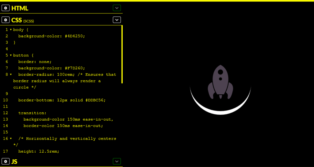
Without the High Contrast Media Query for your launch button, it cannot be visually accessed. The button’s icon color has a contrast ratio of 2.2 when viewed in High Contrast Mode on a black background. This fails the WCAG 2.0 criteria for acceptable contrast:

Although the white crescent of the bottom edge has a high enough contrast ratio to be visually apparent, there is not enough supporting information to communicate that it is part of a button.
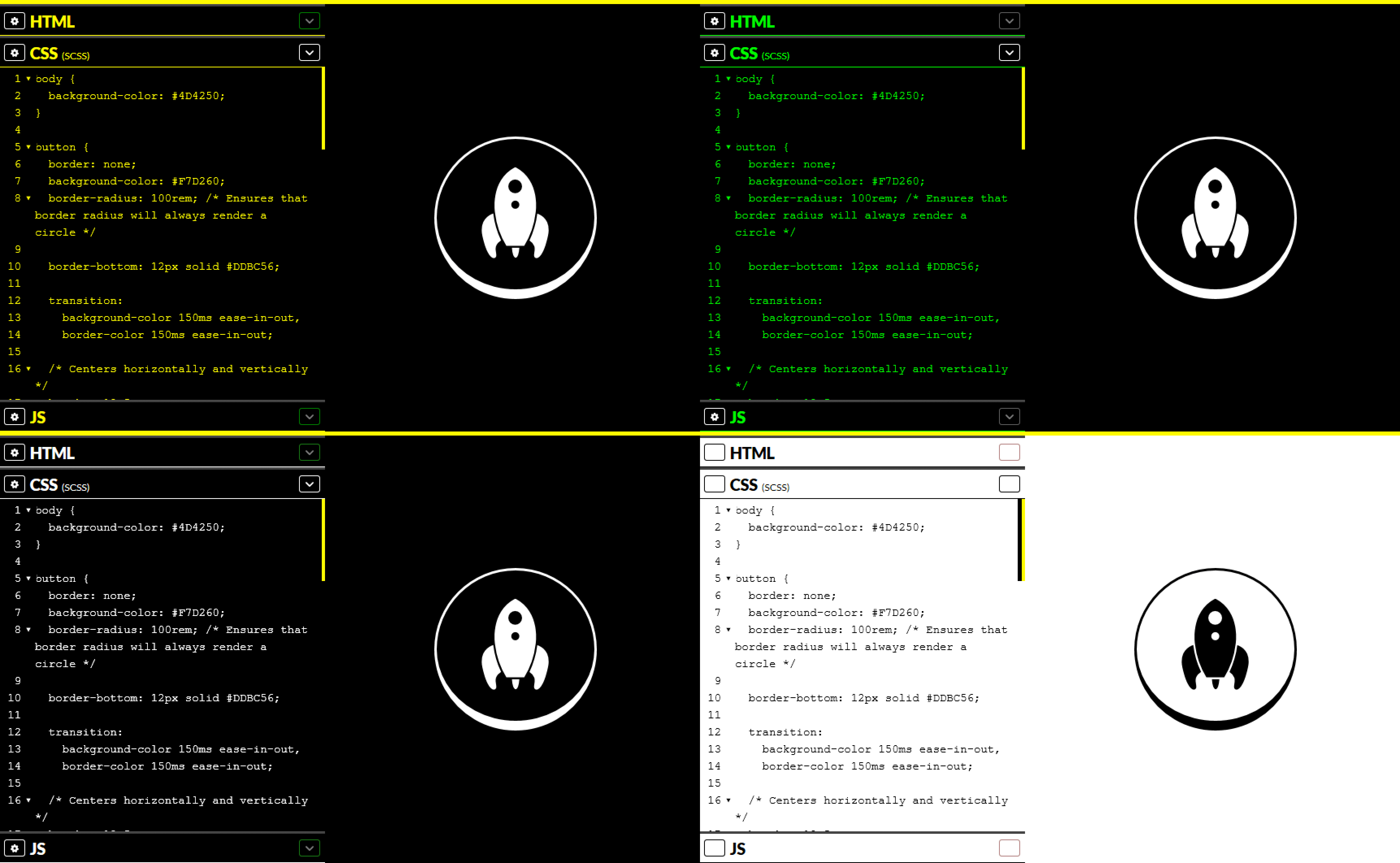
With the slightest of tweaks, the button can be made visually apparent regardless of what High Contrast Mode theme is being used:

If you are working with an icon system, and your icons are simple enough that they can be reduced to one color without losing meaning, you may want to consider hooking all your high contrast tweaks to the same immutable class that controls all the other icon styling:
@media screen and (-ms-high-contrast: active) {
  .button-icon {
    fill: ButtonText;
  }
}
More complicated icons and illustrations with multiple colors should be handled on a case-by-case basis, as blanket styling instructions might turn them into unrecognizable blobs, or communicate interactivity where there is none.
Another interesting notion for dealing with images in High Contrast Mode is the idea of using CSS filters to enhance what is already there. Although there isn’t perfect coverage, properties such as saturation(), brightness(), and contrast() could progressively enhance the content without destroying the original image:
@media screen and (-ms-high-contrast: active) {
  main .post-image {
    filter: brightness(1) contrast(1) saturate(1.5);
  }
}
“Well then, what about all the little images on my site? You know, the textures, flourishes, and illustrations that I use to decorate it?”
Decorative imagery is just that—decorative. Eliminate these kinds of distractions by semantically negating ornamental elements using techniques such as CSS’s background-image property and the ARIA declaration of aria-hidden="true". It ensures that High Contrast Mode’s parser doesn’t get hung up on anything non-essential.
“Okay, I’m still with you. What about luminosity media queries? Will they be a thing I’ll need to consider soon?”
The simple answer is: don’t make things more difficult than they need to be. The fewer exceptions you have to juggle, the easier things are to maintain. By ensuring your design uses a sufficient contrast ratio for all its component pieces under default viewing conditions, as well as providing text labels where needed, you remove all the extra overhead that comes with juggling multiple versions. Plus, you get WCAG compliance for free. Nice!
SO HANDY! Thanks, Eric!
I’ve always enjoyed css-tricks. And I feel like somehow the quality of articles is getting even better!
Another great, in-depth explanation . Thanks!
“This is just a reminder that Windows is still an incredibly popular operating system, running on more than half of the total desktop operating system market share. ”
A bit misleading, it’s closer to 90% than half.