DigitalOcean provides cloud products for every stage of your journey. Get started with $200 in free credit!
The CSS position-try-fallbacks property accepts a list of different options for a “target” element to position itself relative to an “anchor” element by trying a declared list of comma-separated options. If the first option doesn’t have the available space to display the target element, then it tries the next option, and so forth, not totally unlike setting fallback fonts a font-family.
.target {
  position: absolute;
  position-anchor: --my-anchor;
  position-area: top left;
  position-try-fallbacks: flip-inline, bottom left, --my-custom-position;
}
For context, this is all part of the CSS Anchor Positioning specification, a set of many features that work together to position an element, that we may call “target”, to another, called “anchor”.
From Chrome 129+ onwards, the position-try-options property is now named position-try-fallbacks. For now, the recommendation is to use the position-try shorthand property instead.
Syntax
position-try-fallbacks: none | [ [<dashed-ident> || <try-tactic>] | <'position-area'> ]#- Initial value: none
- Applies to: absolutely-positioned elements
- Inherited: no
- Percentages: n/a
- Computed value: as specified
- Canonical order: per grammar
- Animation type: discrete
Values
/* Custom @try-position */
position-try-fallbacks: --my-custom-position;
position-try-fallbacks: --myCustomPosition;

/* <try-tactic> */
position-try-fallbacks: flip-block;
position-try-fallbacks: flip-inline;
position-try-fallbacks: flip-start;
position-try-fallbacks: flip-block flip-inline;

/* `<dashed-ident>` || `<try-tactic>` */
position-try-fallbacks: --my-custom-position flip-block;
position-try-fallbacks: --myCustomPosition flip-block flip-inline;

/* <'position-area'> */
position-try-fallbacks: bottom center;
position-try-fallbacks: top left;

/* All can be together! */
position-try-fallbacks: --my-custom-position, flip-block flip-inline, --my-custom-position flip-block, top left;
The position-try-fallbacks property accepts a list of comma-separated options to position the target element when it overflows its containing block. The order is as written, but can be ordered using the position-try-order property.
none:Leaves the target’s position options list empty.<dashed-ident>:Adds to the options list a custom@position-tryoption with the given name. If there isn’t a matching@position-try, the value is ignored. The value is called a “dashed” ident because it must be prefixed with two dashes (–).<try-tactic>:Creates an option list by flipping the target’s current position on one of three axes, each defined by a distinct keyword. They can also be combined to add up their effects.<dashed-ident>||<try-tactic>:Combines a custom@try-optionand a<try-tactic>to create a single option list by flipping the custom@position-tryas specified. The<try-tactic>keywords can also be combined to sum up their effects.<'position-area'>:Using theposition-areasyntax around a wrapper function moves the target to a newposition-area.
From Chrome 129+ onwards, the inset-area() function doesn’t exist and you can the <'position-area'> without any wrapper function.
Why we need position-try-options
Positioning elements relative to an anchor seems like a task of two steps: (1) link the target to an anchor element and (2) position it around that anchor. However, an anchor element can be anywhere on the page and even change positions due to scrolling, zooms, animations, etc. As a result, a target element can easily run out of space to position itself relative to the anchor and overflow beyond its containing block (which is the viewport, by default).
That’s a normal occurrence; we can’t stop an element from going off-screen when scrolling, but we can improve the experience by maximizing its screen time.
A common use for anchor positioning is tooltips, and they have the recurring problem of overflowing off-screen a little too much. For example, a tooltip at the top of an element will overflow when scrolling downwards.
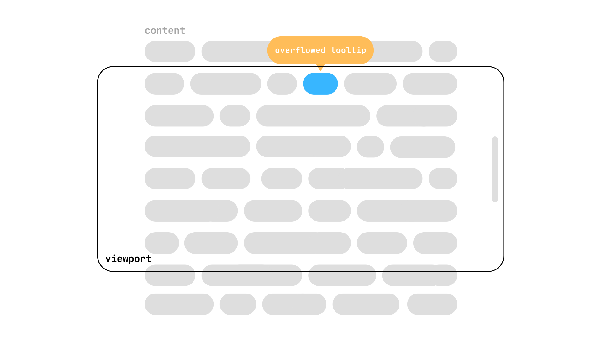
Traditionally, the only way to avoid it would be to dynamically change the tooltip’s position using JavaScript but with position-try-fallbacks we can achieve the same with only CSS.
Using position-try-options
To start using the position-try-fallbacks property in CSS, we need our main characters: the anchor and target elements.
<div class="anchor">My Anchor</div>
<div class="target">My Target</div>
and a sprinkle of CSS to link them together:
.anchor {
  anchor-name: --my-anchor;
}

.target {
  position: absolute;
  position-anchor: --my-anchor;
}
If we don’t position our target in any special way, it will rest below its default anchor. We can move it on top using the anchor() function along the target’s inset properties or using the position-area property. Whichever options you choose, remember it for later.
.target {
  position: absolute;
  position-anchor: --my-anchor;

  position-area: top;
  /* or */
  bottom: anchor(top);
}
Our target is above its anchor, but the problem comes when we scroll downwards and see the target waving us goodbye as it disappears beyond the viewport. This target could be a tooltip or other popover that displays relevant information about its anchor element, but now the anchor is visible and its relevant target isn’t.
This is a problem as old as time and the best solutions always included JavaScript to achieve a tooltip that doesn’t overflow out of the screen, or even libraries like Popper.js.
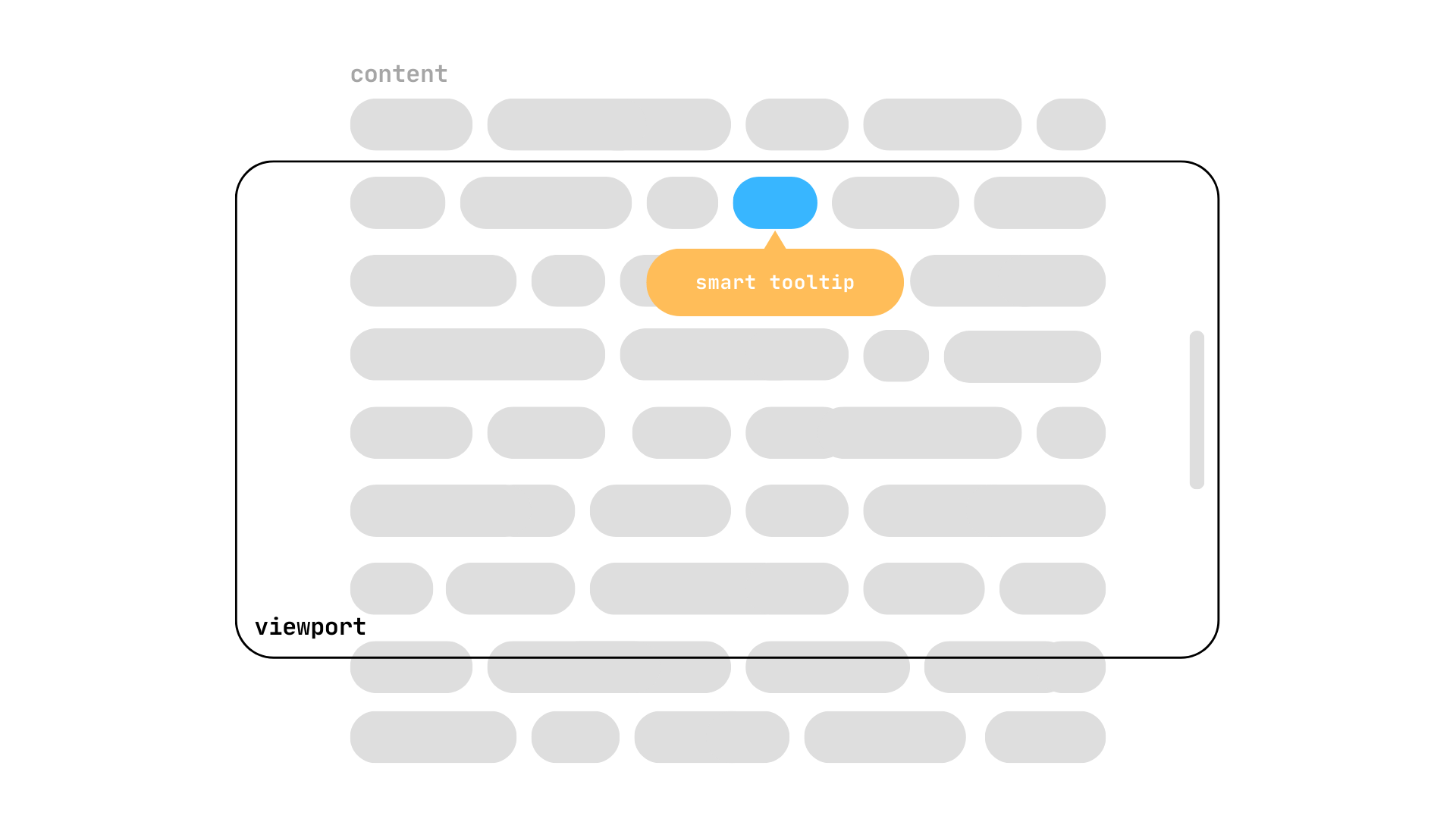
With position-try-fallbacks we can write a list of possible positions whenever our target goes out of the viewport. Your browser will try these options in their written order until it finds one that doesn’t overflow or runs out of options.
<'position-area'>
To start things off simply, we have the <'position-area'> keywords that accepts all the values that your regular position-area property would take. We could give a list of possible position-area options and the target will try them whenever it overflows. For example, moving the target from top to bottom.
.target {
  position: absolute;
  position-anchor: --my-anchor;

  position-area: top;
  position-try-fallbacks: bottom;
}
We could also give a list of multiple <'position-area'> keywords to move the target around its anchor when needed
.target {
  position: absolute;
  position-anchor: --my-anchor;

  position-area: top left;
  position-try-fallbacks:
    top, top right,
    right, bottom,
    bottom right;
}
<dashed-ident>
We can create custom position options using the @position-try at-rule to modify the target’s position. It accepts almost every property that can modify the element’s position:
Inset properties (
top,left,bottom,right,inset-block,inset-inline, etc.)Margin properties (
margin,margin-block,margin-inline, etc.)Sizing properties (
width,min-width,height,max-height,inline-size,block-size, etc,)Self-alignment properties (
align-self,justify-self,place-self)Position anchor properties (
position-anchor,position-area)
So, for example, we could make our target smaller whenever it’s overflowing:
@position-try --smaller-target {
  width: 50px;
}

.target {
  position: absolute;
  position-anchor: --my-anchor;
  position-area: top;
  position-try-fallbacks: --smaller-target;

  width: 120px;
  aspect-ratio: 1;
}
I told you to remember if you used the anchor() function with inset properties or the position-area property to position your anchor. Why? Because changing them with the @try-position at-rule won’t work if we’re inconsistent with the original declaration. For example, the following --custom-bottom won’t work because we aren’t using the same method to position the target.
@position-try --custom-bottom {
  width: 50px;
  top: anchor(bottom);
}

.target {
  /* ... */
  position-area: top;
  position-try-fallbacks: --custom-bottom;
}
We have to make the positioning methods match:
@position-try --custom-bottom {
  width: 50px;
  position-area: bottom;
}
<try-tactic>
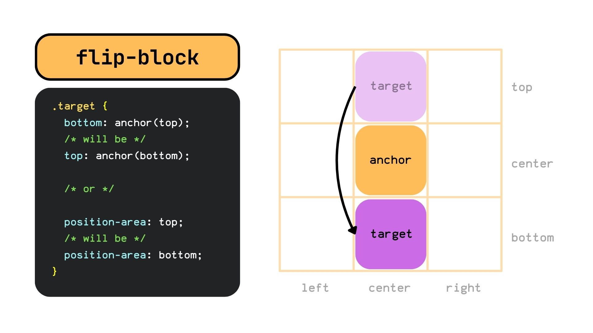
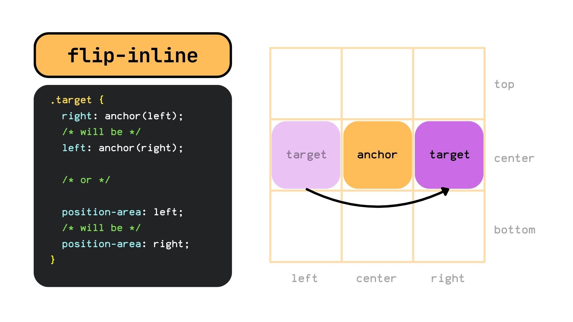
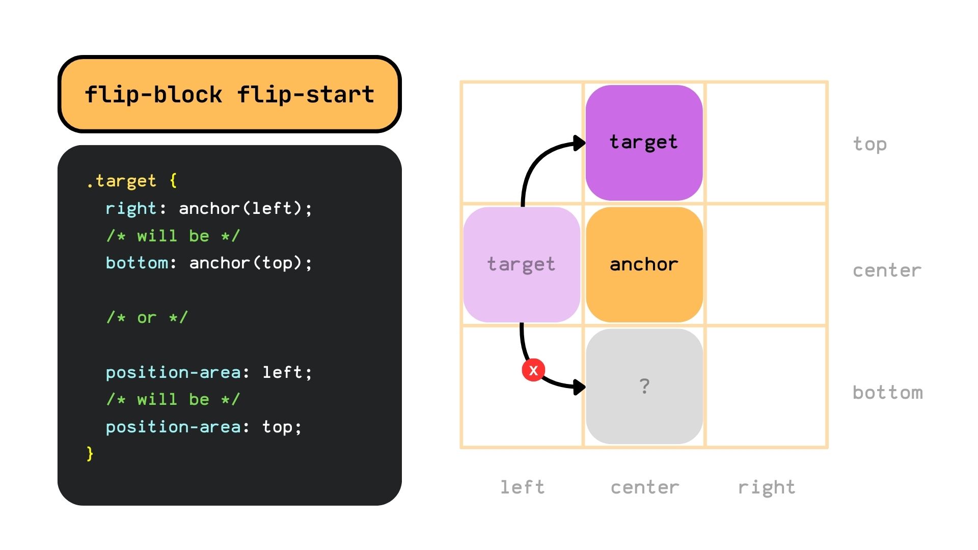
The <try-tactic> value creates a new position option by swapping its position according to the specified try tactic. It has three possible keywords, each specifying which values will be swapped, essentially changing the target from one side to the other.
The flip-block keyword swaps the values in the block axis.
The flip-inline keyword swaps the values in the inline axis.
The flip-start keyword swaps the values diagonally. I gotta admit that flip-start is a weird <try-tactic> that still is a little confusing to me. In the case of single values, it will position them on an adjacent side.
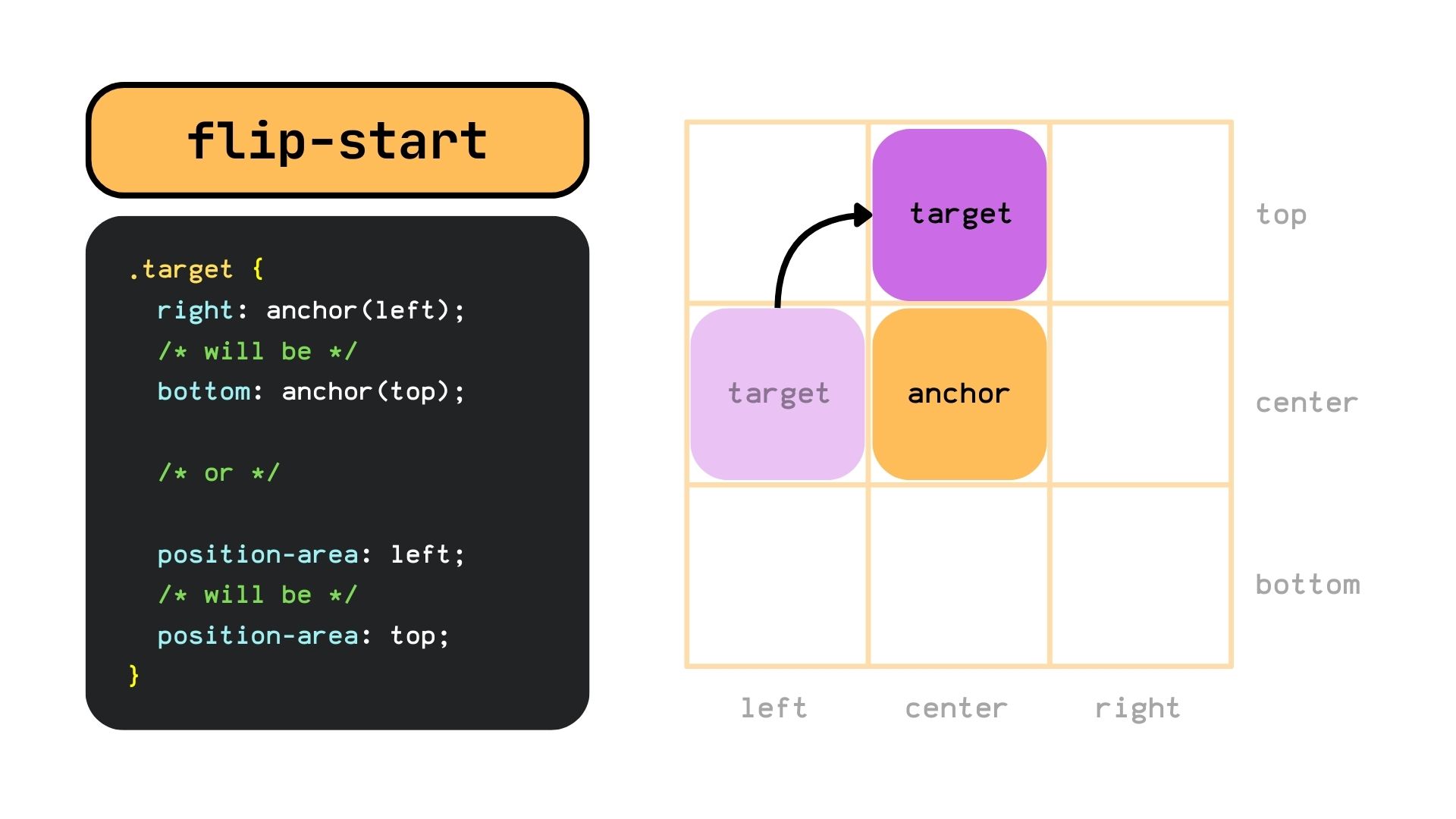
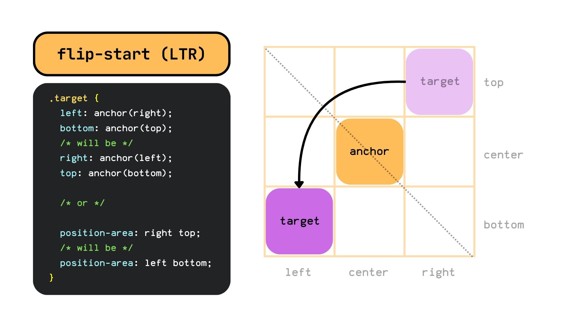
But if the target has two values, it will position them on the opposite corner. At least in theory, in practice, it will only be able to flip the target from the top right corner to the left bottom and vice versa on LTR.
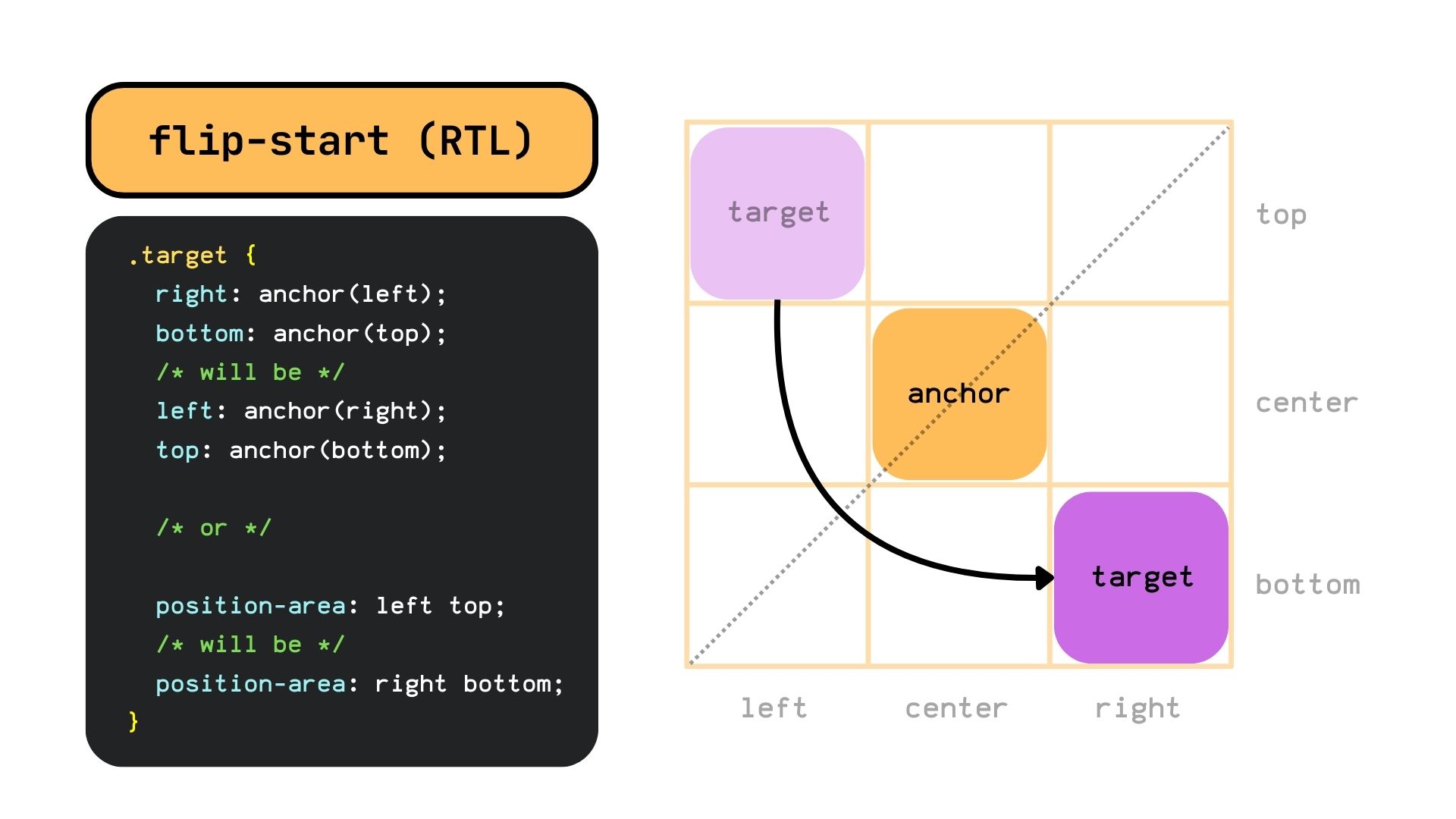
And from the top-left corner to the right-bottom, and vice versa on RTL.
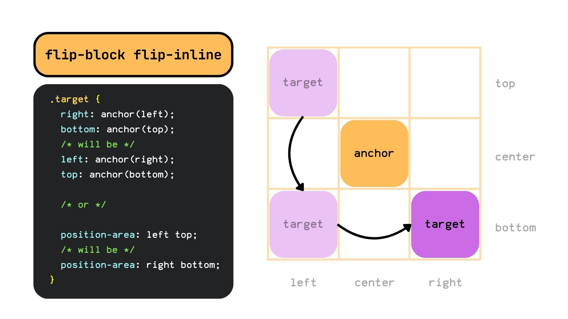
If we want a target that flips to the opposite corner no matter the text direction, we can combine the flip-block and flip-inline keywords. It will first flip the anchor in the block axis and then on the inline axis.
Lastly, we can combine the flip-start value with flip-block or flip-inline to flip the target to another adjacent side.
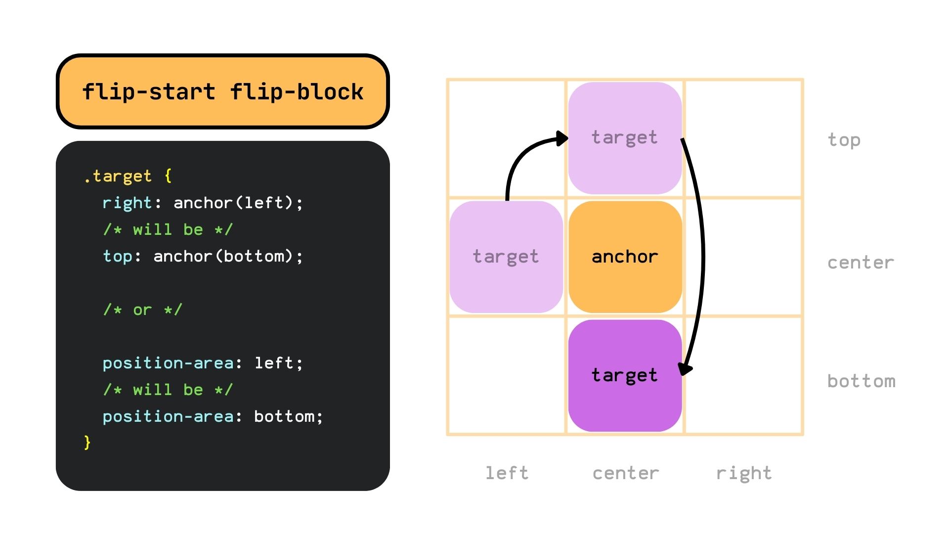
Order does matter, so writing flip-start flip-block will result in a different position from flip-block flip-start. On the latter, the flip-block keyword gets executed first, and since the target isn’t on the block axis it doesn’t have any effect and gets ignored.
<dashed-ident> || <try-tactic>
Lastly, we can combine both a custom @try-position option with one or more <try-tactic> keywords, creating a new position option and essentially flipping the @try-position properties. For example, the custom position option…
@try-position --custom-right {
  position-area: top;
  align-self: start;
}
…if flipped with the flip-block keyword will compute to the following:
@try-position --custom-right {
  position-area: bottom;
  align-self: end;
}
Demo
Specification
The position-try-options property is defined in the CSS Anchor Positioning Module Level 1 specification, which is currently in Working Draft status at the time of writing. That means a lot can change between now and when the feature becomes a formal Candidate Recommendation for implementation.
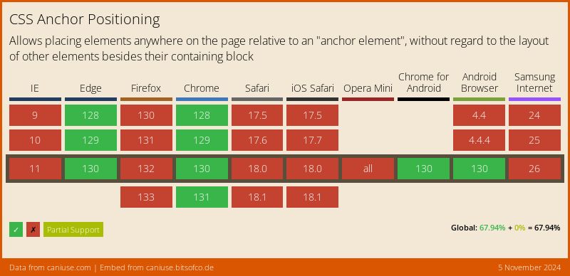
Browser support
More information and tutorials
- “CSS Anchor Positioning” (CSSWG)
- “Introducing the CSS anchor positioning API” (Una Kravets)
- “CSS Stuff I’m Excited After the Last CSSWG Meeting” (Juan Diego Rodríguez)