DigitalOcean provides cloud products for every stage of your journey. Get started with $200 in free credit!
The CSS position-try-order property sets the order of positions that a target element tries to use to display itself around an anchor element. You can think of it as setting a preferred position for the target element with additional options if the ideal position lacks the space to display it.
For example, we can tell the target element to position itself using the option with the most-width:
.target {
  position: absolute;
  position-anchor: --my-anchor;
  position-area: top right;

  position-try-fallbacks: flip-inline, flip-start;
  position-try-order: most-width;
}
And if that option is used, the remaining options are reordered with the largest options coming first. The property requires being paired with the position-anchor property to register an element for the target element to anchor itself to, as well as the anchor position-try-fallbacks property that defines the options that are ordered by position-try-order. That’s because it is part of the CSS Anchor Positioning specification, a set of many features that work together to position one element, that we may call target, relative to another, called anchor.
Note: From Chrome 129+ onwards, the position-try-options property is now named position-try-fallbacks. For now, the recommendation is to use the position-try shorthand property instead.
Syntax
position-try-order: normal | <try-size>

<try-size> = most-width | most-height | most-block-size | most-inline-size- Initial value: normal
- Applies to: absolutely positioned elements
- Inherited: no
- Percentages: n/a
- Computed value: as specified
- Canonical order: per grammar
- Animation type: discrete
Values
/* <try-size> keywords */
position-try-order: normal;
position-try-order: most-width;
position-try-order: most-height;
position-try-order: most-block-size;
position-try-order: most-inline-size;

/* Global values */
position-try-order: inherit;
position-try-order: initial;
position-try-order: revert;
position-try-order: revert-layer;
position-try-order: unset;normal: The position options will be tried in the order specified in theposition-try-fallbacksproperty.<try-size>: For each position option, find the resulting inset-modified containing block size for the target. Then sort the position options list by that size, with the largest in the selected direction first. To choose which direction, there are four keywords:most-widthmost-heightmost-block-sizemost-inline-size
What is the “inset-modified” containing block?
Wow, the prior syntax seems a little convoluted. At least to me, it was confusing to fully understand it without knowing what an “inset-modified containing block” is. To explain it, we should backtrack to what exactly is a containing block.
On a regular element with a static position, its containing block will be the nearest block element ancestor. For example, in the following HTML, the <main> element is the <div>‘s containing block:
<body>
   <main> <!-- The containing block of <div> -->
     <div></div>
   </main>
</body>
Absolutely-positioned elements escape the normal document flow and, as a consequence, their containing block. Its new containing block will be the nearest ancestor with a position other than static and if there isn’t, it will be the viewport by default. So in the case of a regular anchor element, its containing block will be the whole screen.
Now, by spec definition, “for an absolutely positioned box, the inset properties effectively reduce the containing block into which it is sized and positioned by the specified amounts. The resulting rectangle is called the inset-modified containing block.”
In a normal absolutely positioned element, its inset-modified containing block will be determined logically by its inset properties (top, left, right, bottom). We can easily see it in the following example:
.absolute-position {
  position: absolute;
  top: 80px;
  right: 120px;
  bottom: 180px;
  left: 90px;
}
Its containing block is the whole viewport, and its inset-modified containing block is 80px away from the top, 120px away from the right, 180px away from the bottom and 90px away from the left.
In the case of an anchor element, the containing block can be broken down into a grid divided by four imaginary lines:
- The start of the target’s containing block.
- The start of the anchor element or
anchor(start). - The end of the anchor element or
anchor(end) - The end of the target’s containing block.

The target’s inset-modified containing block will be the region on the grid on which it is placed, for example, the following target element…
.target {
  position: absolute;
  position-anchor: --my-anchor;
  position-area: top right;

  height: 50px;
  idth: 50px;
}
…will have the following containing block:

We can see exactly how the inset-modified containing grows and shrinks if we set the target’s height and width to 100%.
Using position-try-order
Now that we know what the inset-modified containing block is for a target element, we can see how the position-try-order property decides which position to select. For example, we can link the following elements together…
<main>
  <div class="anchor">Anchor</div>
  <div class="target">Target</div>
</main>
…using anchor positioning:
.anchor {
  anchor-name: --my-anchor;
}

.target {
  position: absolute;
  position-anchor: --my-anchor;
}
If we position the .target at the top right of its .anchor it will overflow whenever we scroll down, so we could add a new position-try-fallbacks option to flip it to the bottom right whenever that happens:
.target {
  position: absolute;
  position-anchor: --my-anchor;
  position-area: top right;
  position-try-fallbacks: flip-block;
}
To finish off, we choose the position that gives the .target element’s inset-modified containing block the most height as the default using the most-height keyword.
.target {
  position: absolute;
  position-anchor: --my-anchor;
  position-area: top right;
  position-try-fallbacks: flip-block;
  position-try-order: most-height;
}
Again, we can see it in action if we set the .target element’s height and width to 100%.
The containing block is resizable, so move it around to see how the position changes as the amount of space changes!
Demo
Specification
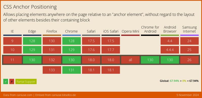
The position-try-order property is defined in the CSS Anchor Positioning Module Level 1 specification, which is currently in Working Draft status at the time of writing. That means a lot can change between now and when the feature becomes a formal Candidate Recommendation for implementation.
Browser support
More information and tutorials
- “CSS Anchor Positioning” (CSSWG) (For the feisty)
- “Anchor Positioning Visual Representation” (Una Kravets)
- “Introducing the CSS anchor positioning API” (Una Kravets)
- “CSS Stuff I’m Excited After the Last CSSWG Meeting” (Juan Diego Rodríguez)
