DigitalOcean provides cloud products for every stage of your journey. Get started with $200 in free credit!
The CSS @position-try at-rule defines a custom position fallback for the position-try-fallbacks property. It takes various properties that can change a target element’s position and size and groups them in a new position fallback whenever the target overflows beyond its containing block.
@position-try --my-custom-position {
  position-area: top left;
  width: 50px;
}

.target {
  position: absolute;
  position-area: top right;
  position-try-fallbacks: --my-custom-position;
}
The @position-try at-rule is part of the CSS Anchor Positioning module, a set of many features that work together to position an element that we call a “target” to another element we call an “anchor”.
From Chrome 129+ onwards, the position-try-options property is now named position-try-fallbacks. The same thing happened to inset-area which is now position-area. Chrome will support inset-area until Chrome 131 to give you a chance to update demos, so be wary when it may change!
Syntax
@position-try <dashed-ident> {
  <declaration-list>
}
If a <dashed-ident> is not provided for a @position-try declaration, then the position-try-fallbacks property will ignore it, but all other options will still work.
Values
@position-try --my-new-position {
  /* Inset properties */
  top: anchor(bottom);
  right: anchor(left);

  /* Margin properties */
  margin-left: 10px;
  margin-bottom: 30px;

  /* Sizing properties */
  width: 50px;
  height: 50px;

  /* Self-alignment properties */
  align-self: center;
  justify-self: end;

  /* Position anchor properties */
  position-anchor: --other-anchor;
  position-area: top right;
}
The @position-try rule only accepts the following types of CSS properties as values in its declaration list:
- Inset properties:
top,left,bottom,right,inset,inset-block,inset-inline, etc. - Margin properties:
margin,margin-block,margin-inline,margin-top,margin-left, etc. - Sizing properties:
width,min-width,height,max-height,inline-size,block-size, etc. Note that theaspect-ratioproperty is not supported. - Self-alignment properties:
align-self,justify-self,place-self - Position anchor properties:
position-anchor,position-area
Don’t use !important. Doing so will invalidate the selected property. That said, it doesn’t invalidate the rest of the <declaration-list>.
Why we need @position-try
After attaching a target element relative to an anchor, it is bound to overflow at some point due to a user’s scroll or zoom settings, running animations, etc. We can’t prevent a target from overflowing its containing block… but we can ensure it stays on the screen as long as possible using the position-try-fallbacks property.
For example, a target positioned on top of its anchor…
.target {
  position: absolute;
  position-area: top;
}
This causes overflow when scrolling down:

With position-try-fallbacks we can flip the .target element to the opposite side of its anchor using the correct <try-tactic> keyword from the current three (flip-block,flip-inline,flip-start).
.target {
  position: absolute;
  position-area: top;
  position-try-fallbacks: flip-block;
}
While flipping the .target element will get the job done in most cases, sometimes we need more control whenever it overflows, and that’s exactly what @position-try does. It lets you set the properties that affect the size and position of the target element and apply them whenever it overflows.
Using @position-try
To start, we first need our anchor and target elements:
<div class="anchor">My Anchor</div>
<div class="target">My Target</div>
Ler’s attach them using the power of anchor positioning. We register the .anchor element with the anchor-name property and set it as the .target element’s anchor with the position-anchor property:
.anchor {
  anchor-name: --my-anchor;
}

.target {
  position: absolute;
  position-anchor: --my-anchor;
  position-area: top;
  width: 80px;
  height: 100px;
  margin: 20px;
}
Now let’s place the .anchor in the center of the page and make the body bigger so we can scroll around ir.
body {
  display: flex;
  align-items: center;
  justify-content: center;
  height: 250vh;
}
If we scroll down the page, the .target element begins to overflow the space while its .anchor is still visible. And as we saw before, we could solve this issue by flipping the .target to the .anchor element’s bottom edge using the position-try-fallbacks property and the flip-block try tactic.
.target {
  position: absolute;
  position-anchor: --my-anchor;
  position-area: top;
  position-try-fallbacks: flip-block;

  width: 80px;
  height: 100px;
  margin: 20px;
}
However, we could also shrink the target before it overflows so that it’s still visible at the top of the .anchor. To do that we would have to define a new position fallback using the @position-try at-rule.
@position-try --compact-target {
  height: 40px;
  margin: 0px;
}

.target {
  position-try-fallbacks: --compact-target, flip-block;
  /* etc. */
}
This way, the anchor squishes and, if necessary, it flips to the bottom.
@position-try and <try-tactic>
You may have noticed the comma separating the @position-try and the <try-tactic> values on the position-try-fallbacks property. We can actually write those values together to sum up their effects! For example, if we were to remove the comma, the .target element would flip to the .anchor element’s bottom edge and gets squished in the process.
position-try-fallbacks: --compact-target flip-block;Or we can list several combinations together:
position-try-fallbacks: --compact-target, --compact-target flip-block;Specification
The @position-try at-rule is defined in the CSS Anchor Positioning Module Level 1 specification, which is currently in Working Draft status at the time of writing. That means a lot can change between now and when the feature becomes a formal Candidate Recommendation for implementation.
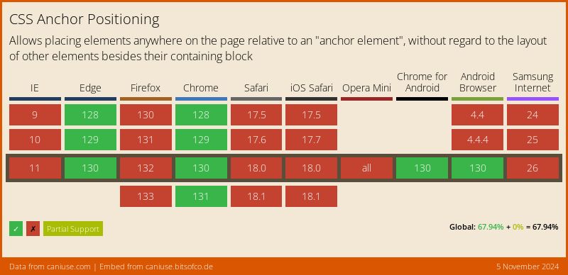
Browser support
More information
- Video: CSS Anchor Positioning in Practice (Miriam Suzanne, James Stuckey Weber)
- Anchor Positioning Visual Representation (Una Kravets)
- Introducing the CSS anchor positioning API (Una Kravets)
Related
anchor()
.target { top: anchor(--my-anchor bottom); }
anchor-name
.anchor { anchor-name: --my-anchor; }
anchor-size()
.target { width: anchor-size(width); }
position-area
.target { position-area: bottom end; }
position-anchor
.target { position-anchor: --my-anchor; }
position-try-fallbacks
.target { position-try-fallbacks: flip-inline, bottom left; }
position-try-order
.element { position-try-order: most-width; }
position-visibility
.target { position-visibility: no-overflow; }
