In perhaps in the top 5 most annoying things a website can do is this. You’re trying to read something (or click something!) and all the sudden the page shift underneath you (or you mis-click!). There is a CSS property that can help fix that. Plus, we can exploit it to do something that was previously exclusively in the realm of JavaScript.
The overflow-anchor property in CSS is relatively new, first debuting in 2017 with Chrome¹, Firefox in 2019, and now Edge picking it up with the Chrome transition in 2020. Fortunately, its use is largely an enhancement. The idea is that browsers really try to not to allow position shifting by default. Then if you don’t like how it’s handling that, you can turn it off with overflow-anchor. So generally, you never touch it.
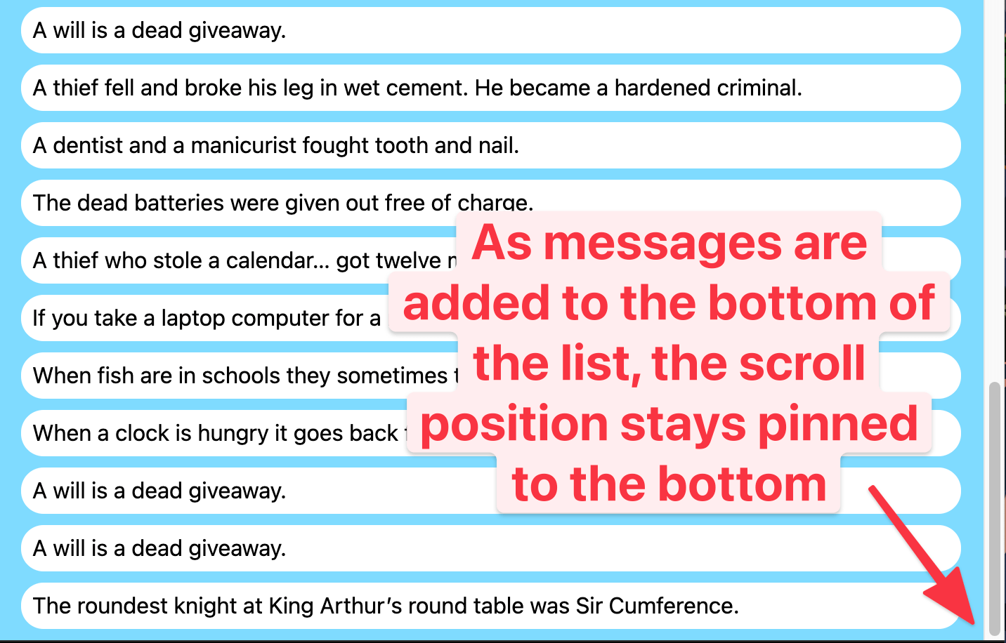
But as you might suspect, we can exploit this little beauty for a little CSS trickery. We can force a scrolling element to stay pinned down to the bottom even as we append new content.

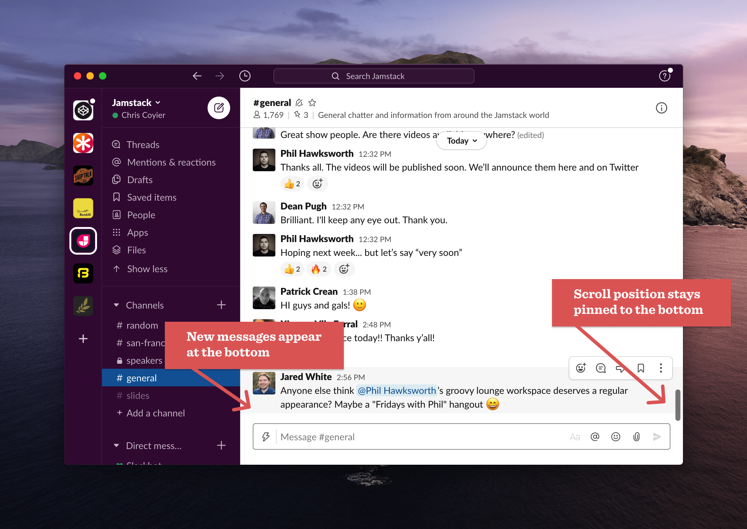
We expect this behavior in a UI like Slack, where if we’re scrolled down to the most recent messages in a channel, when new messages arrive, they are visible at the bottom immediately, we don’t have to manually re-scroll down to see them.
This feature comes by way of Ryan Hunt who also credits Nicolas Chevobbe.
As Ryan says:
Have you ever tried implementing a scrollable element where new content is being added and you want to pin the user to the bottom? It’s not trivial to do correctly.
At a minimum, you’ll need to detect when new content is added with JavaScript and force the scrolling element to the bottom. Here’s a technique using MutationObserver in JavaScript to watch for new content and forcing the scrolling:
const scrollingElement = document.getElementById("scroller");

const config = { childList: true };

const callback = function (mutationsList, observer) {
  for (let mutation of mutationsList) {
    if (mutation.type === "childList") {
      window.scrollTo(0, document.body.scrollHeight);
    }
  }
};

const observer = new MutationObserver(callback);
observer.observe(scrollingElement, config);
Here’s a demo of that.

But I find a CSS-only solution far more enticing! The version above has some UX pitfalls we’ll cover later.
The trick here is that browsers already do scroll anchoring by default. But what browsers are trying to do is not shift the page on you. So when new content is added that might shift the visual position of the page, they try to prevent that from happening. In this unusual circumstance, we sort of want the opposite. We want the page to be stuck at the bottom of the page and have the visual page visually move, because it is forced to to remain stuck to the bottom.
Here’s how the trick works. First some HTML within a scrolling parent element:
<div id="scroller">
  <!-- new content dynamically inserted here -->
  <div id="anchor"></div>
</div>
All elements naturally have a overflow-anchor: auto; on them which means they attempt to prevent that page shifting when they are on the screen, but we can turn that off with overflow-anchor: none;. So the trick is to target all that dynamically inserted content and turn it off:
#scroller * {
  overflow-anchor: none;
}
Then force only that anchor element to have the scroll anchoring, nothing else:
#anchor {
  overflow-anchor: auto;
  height: 1px;
}
Now once that anchor is visible on the page, the browser will be forced to pin that scroll position to it, and since it is the very last thing in that scrolling element, remain pinned to the bottom.
There are two little caveats here…
- Notice the anchor must have some size. We’re using
heighthere to make sure it’s not a collapsed/empty element with no size, which would prevent this from working. - In order for scroll anchoring to work, the page must be scrolled at least once to begin with.
That second one is harder. One option is to not deal with it at all, you could just wait for the user to scroll to the bottom, and the effect works from there on out. It’s kind of nice actually, because if they scroll away from the bottom, the effect stops working, which is what you want. In the JavaScript version above, note how it forces you to the bottom even when you try to scroll up, that’s what Ryan meant by this not being trivial to do correctly.
If you need the effect kicked off immediately, the trick is to have the scrolling element be scrollable immediately, for example:
body {
  height: 100.001vh;
}
And then trigger a very slight scroll right away:
document.scrollingElement.scroll(0, 1);And that should do the trick. Those lines are available in the demo above to uncomment and try.
- Speaking of Chrome, Google takes this layout shifting stuff very seriously. One of the Web Core Vitals is Cumulative Layout Shift (CLS), which measures visual stability. Get a bad CLS score, and it literally impacts your SEO.