You’d be forgiven for thinking coding up both a dark and a light mode at once is a lot of work. You have to remember @media queries based on prefers-color-scheme as well as extra complications that arise when letting visitors choose whether they want light or dark mode separately from the OS setting. And let’s not forget the color palette itself! Switching from a “light” mode to a “dark” mode may involve new variations to get the right amount of contrast for an accessible experience.
It is indeed a lot of work. But I’m here to tell you it’s now a lot simpler with modern CSS!
Default HTML color scheme(s)
We all know the “naked” HTML theme even if we rarely see it as we’ve already applied a CSS reset or our favorite boilerplate CSS before we even open localhost. But here’s a news flash: HTML doesn’t only have the standard black-on-white theme, there is also a native white-on-black version.

If you want to create a dark mode interface, this is a great base to work with and saves you from having to account for annoying details, like dark inputs, buttons, and other interactive elements.

Switching color schemes automatically based on OS preference
Without any @media queries — or any other CSS at all — if all we did was declare color-scheme: light dark on the root element, the page will apply either the light or dark color scheme automatically by looking at the visitor’s operating system (OS) preferences. Most OSes have a built-in accessibility setting for your preferred color scheme — “light”, “dark”, or even “auto” — and browsers respect that setting.
html {
  color-scheme: light dark;
}
We can even accomplish this without CSS directly in the HTML document in a <meta> tag:
<meta name="color-scheme" content="light dark">Whether you go with CSS or the HTML route, it doesn’t matter — they both work the same way: telling the browser to make both light and dark schemes available and apply the one that matches the visitor’s preferences. We don’t even need to litter our styles with prefers-color-scheme instances simply to swap colors because the logic is built right in!
You can apply light or dark values to the color-scheme property. At the same time, I’d say that setting color-scheme: light is redundant, as this is the default color scheme with or without declaring it.
You can, of course, control the <meta> tag or the CSS property with JavaScript.
There’s also the possibility of applying the color-scheme property on specific elements instead of the entire page in one fell swoop. Then again, that means you are required to explicitly declare an element’s color and background-color properties; otherwise the element is transparent and inherits its text color from its parent element.
What values should you give it? Try:
Default text and background color variables
The “black” colors of these native themes aren’t always completely black but are often off-black, making the contrast a little easier on the eyes. It’s worth noting, too, that there’s variation in the blackness of “black” between browsers.
What is very useful is that this default not-pure-black and maybe-not-pure-white background-color and text color are available as <system-color> variables. They also flip their color values automatically with color-scheme!
They are: Canvas and CanvasText.
These two variables can be used anywhere in your CSS to call up the current default background color (Canvas) or text color (CanvasText) based on the current color scheme. If you’re familiar with the currentColor value in CSS, it seems to function similarly. CanvasText, meanwhile, remains the default text color in that it can’t be changed the way currentColor changes when you assign something to color.
In the following examples, the only change is the color-scheme property:
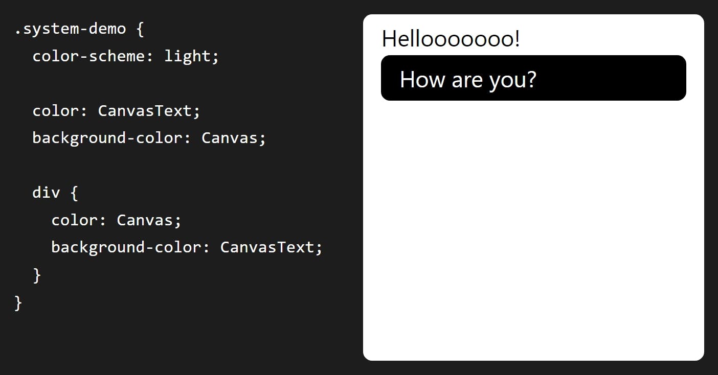
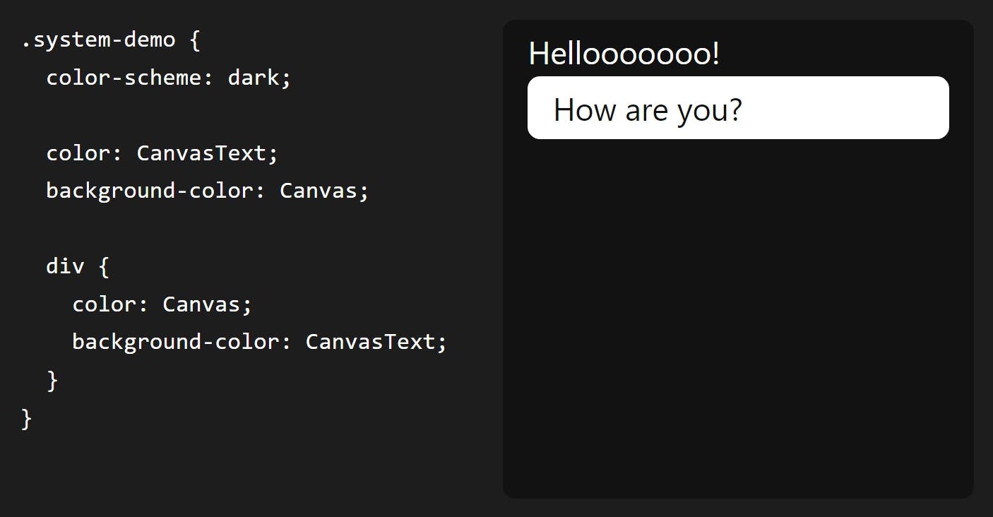
Not bad! There are many, many more of these system variables. They are case-insensitive, often written in camelCase or PascalCase for readability. MDN lists 19 <system-color> variables and I’m dropping them in below for reference.
Open to view 19 system color names and descriptions
AccentColor: The background color for accented user interface controlsAccentColorText: The text color for accented user interface controlsActiveText: The text color of active linksButtonBorder: The base border color for controlsButtonFace: The background color for controlsButtonText: The text color for controlsCanvas: The background color of an application’s content or documentsCanvasText: The text color used in an application’s content or documentsField: The background color for input fieldsFieldText: The text color inside form input fieldsGrayText: The text color for disabled items (e.g., a disabled control)Highlight: The background color for selected itemsHighlightText: The text color for selected itemsLinkText: The text color used for non-active, non-visited linksMark: The background color for text marked up in a<mark>elementMarkText: The text color for text marked up in a<mark>elementSelectedItem: The background color for selected items (e.g., a selected checkbox)SelectedItemText: The text color for selected itemsVisitedText: The text visited links
Cool, right? There are many of them! There are, unfortunately, also discrepancies as far as how these color keywords are used and rendered between different OSes and browsers. Even though “evergreen” browsers arguably support all of them, they don’t all actually match what they’re supposed to, and fail to flip with the CSS color-scheme property as they should.
Egor Kloos (also known as dutchcelt) is keeping an eye on the current status of system colors, including which ones exist and the browsers that support them, something he does as part of a classless CSS framework cleverly called system.css.
Declaring colors for both modes together
OK good, so now you have a page that auto-magically flips dark and light colors according to system preferences. Whether you choose to use these system colors or not is up to you. I just like to point out that “dark” doesn’t always have to mean pure “black” just as “light” doesn’t have to mean pure “white.” There are lots more colors to pair together!
But what’s the best or simplest way to declare colors so they work in both light and dark mode?
In my subjective reverse-best order:
Third place: Declare color opacity
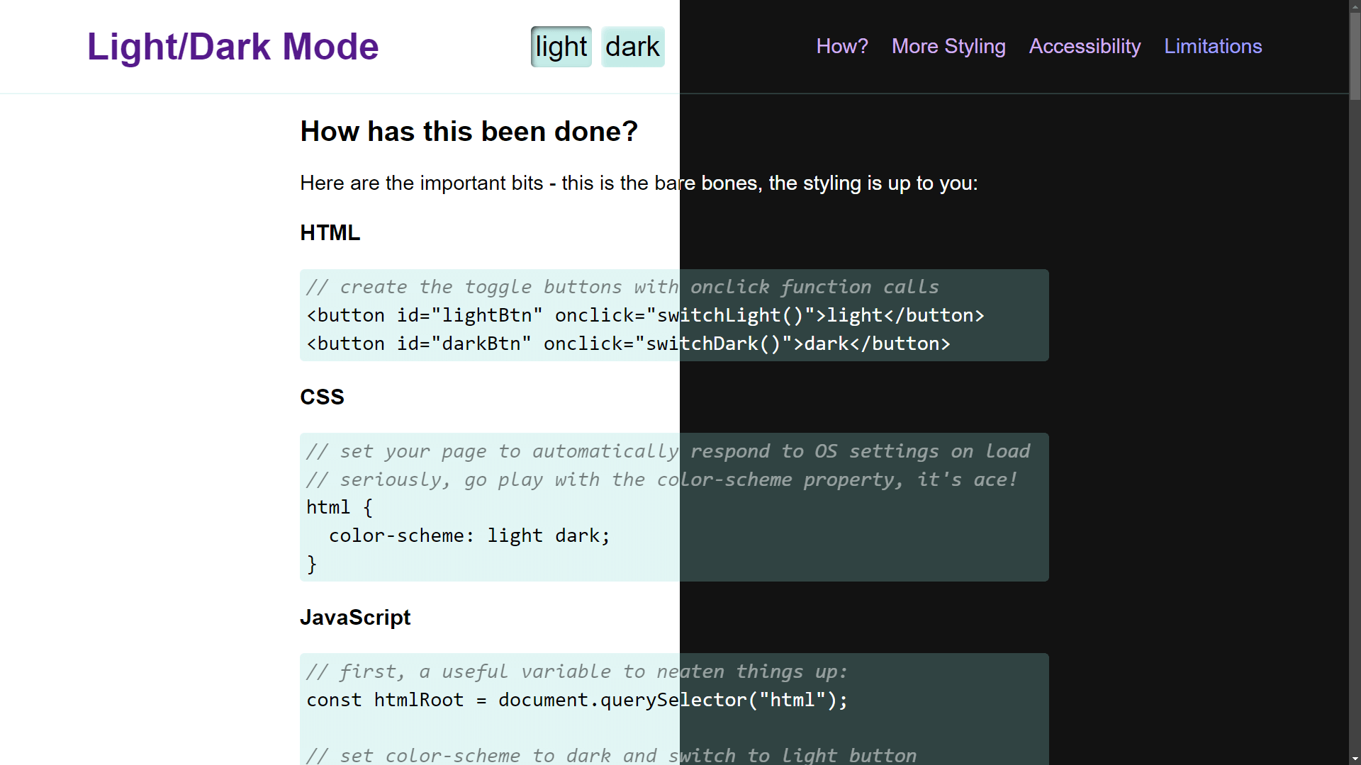
You could keep all the same background colors in dark and light modes, but declare them with an opacity (i.e. rgb(128 0 0 / 0.5) or #80000080). Then they’ll have the Canvas color shine through.
It’s unusable in this way for text colors, and you may end up with somewhat muted colors. But it is a nice easy way to get some theming done fast. I did this for the code blocks on this old light and dark mode demo.
Second place: Use color-mix()
Like this:
color-mix(in oklab, Canvas 75%, RebeccaPurple);Similar (but also different) to using opacity to mute a color is mixing colors in CSS. We can even mix the system color variables! For example, one of the colors can be either Canvas or CanvasText so that the background color always mixes with Canvas and the text color always mixes with CanvasText.
We now have the CSS color-mix() function to help us with this. The first argument in the function defines the color space where the color mixing happens. For example, we can tell the function that we are working in the OKLAB color space, which is a rectangular color space like sRGB making it ideal to mix with sRGB color values for predictable results. You can certainly mix colors from different color spaces — the OKLAB/sRGB combination happens to work for me in this instance.
The second and third arguments are the colors you want to mix, and in what proportion. Proportions are optional but expressed in percentages. Without declaring a proportion, the mix is an even 50%-50% split. If you add percentages for both colors and they don’t match up to 100%, it does a little math for you to prevent breakages.
The color-mix() approach is useful if you’re happy to keep the same hues and color saturations regardless of whether the mode is light or dark.
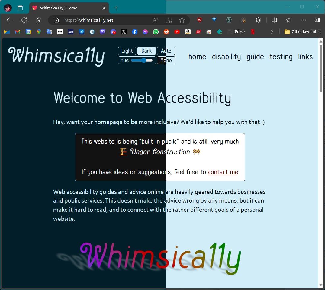
In this example, as you change the value of the hue slider, you’ll see color changes in the themed boxes, following the theme color but mixed with Canvas and CanvasText:
You may have noticed that I used OKLCH and HSL color spaces in that last example. You may also have noticed that the HSL-based theme color and the themed paragraph were a lot more “flashy” as you moved the hue slider.
I’ve declared colors using a polar color space, like HSL, for years, loving that you can easily take a hue and go up or down the saturation and lightness scales based on need. But, I concede that it’s problematic if you’re working with multiple hues while trying to achieve consistent perceived lightness and saturation across them all. It can be difficult to provide ample contrast across a spectrum of colors with HSL.
The OKLCH color space is also polar just like HSL, with the same benefits. You can pick your hue and use the chroma value (which is a bit like saturation in HSL) and the lightness scales accurately in the same way. Both OKLCH and OKLAB are designed to better match what our eyes perceive in terms of brightness and color compared to transitioning between colors in the sRGB space.
While these color spaces may not explicitly answer the age-old question, Is my blue the same as your blue?
the colors are much more consistent and require less finicking when you decide to base your whole website’s palette on a different theme color. With these color spaces, the contrasts between the computed colors remain much the same.
First place (winner!): Use light-dark()
Like this:
light-dark(lavender, saddlebrown);With the previous color-mix() example, if you choose a pale lavender in light mode, its dark mode counterpart is very dark lavender.
The light-dark() function, conversely, provides complete control. You might want that element to be pale lavender in light mode and a deep burnt sienna brown in dark mode. Why not? You can still use color-mix() within light-dark() if you like — declare the colors however you like, and gain much more fine-grained control over your colors.
Feel free to experiment in the following editable demo:
Using color-scheme: light dark; — or the corresponding meta tag in HTML on your page —is a prerequisite for the light-dark() function because it allows the function to respect a person’s system preference, or whichever single light or dark value you have set on color-scheme.
Another consideration is that light-dark() is newly available across browsers, with just over 80% coverage across all users at the time I’m writing this. So, you might consider including a fallback in your CSS for browsers that lack support for the function.
What makes using color-scheme and light-dark() better than using @media queries?
@media queries have been excellent tools, but using them to query prefers-color-scheme only ever follows the preference set within the person’s operating system. This is fine until you (rightfully) want to offer the visitor more choices, decoupled from whether they prefer the UI on their device to be dark or light.
We’re already capable of doing that, of course. We’ve become used to a lot of jiggery-pokery with extra CSS classes, using duplicated styles, or employing custom properties to make it happen.
The joy of using color-scheme is threefold:
- It gives you the basic monochrome dark mode for free!
- It can natively do the mode switching based on OS mode preference.
- You can use JavaScript to toggle between light and dark mode, and the colors declared in the
light-dark()functions will follow it.
Light, dark, and auto mode controls
Essentially, all we are doing is setting one of three options for whether the color-scheme is light, dark, or updates auto-matically.
I advise offering all three as discrete options, as it removes some complications for you! Any new visitor to the site will likely be in auto mode because accepting the visitor’s OS setting is the least jarring default state. You then give that person the choice to stay with that or swap it out for a different color scheme. This way, there’s no need to sniff out what mode someone prefers to, for example, display the correct icon on a toggle and make it perform the correct action. There is also no need to keep an event listener on prefers-color-scheme in case of changes — your color-scheme: light dark declaration in CSS handles that for you.
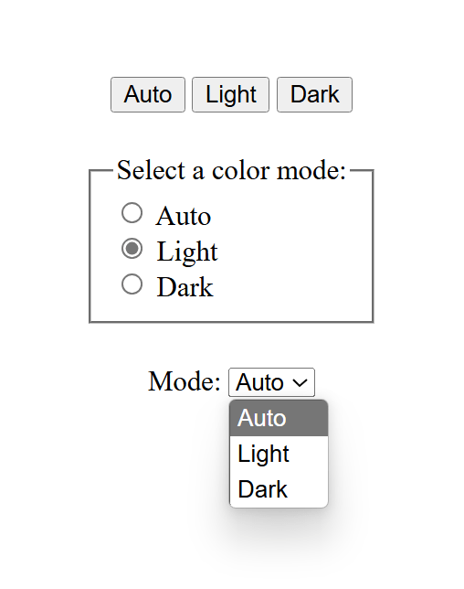
Adjusting color-scheme in pure CSS
Yes, this is totally possible! But the approach comes with a few caveats:
- You can’t use
<button>— only radio inputs, or<options>in a<select>element. - It only works on a per page basis, not per website, which means changes are lost on reload or refresh.
- The browser needs to support the
:has()pseudo-selector. Most modern browsers do, but some folks using older devices might miss out on the experience.
Using the :has() pseudo-selector
This approach is almost alarmingly simple and is fantastic for a simple one-pager! Most of the heavy lifting is done with this:
/* default, or 'auto' */
html {
  color-scheme: light dark;
}

html:has([value="light"]:checked) {
  color-scheme: light;
}

html:has([value="dark"]:checked) {
  color-scheme: dark;
}
The second and third rulesets above look for an attribute called value on any element that has “light” or “dark” assigned to it, then change the color-scheme to match only if that element is :checked.
This approach is not very efficient if you have a huge page full of elements. In those cases, it’s better to be more specific. In the following two examples, the CSS selectors check for value only within an element containing id="mode-switcher".
html:has(#mode-switcher [value="light"]:checked) { color-scheme: light }
/* Did you know you don't need the ";" for a one-liner? Now you do! */
Using a <select> element:
Using <input type="radio">:
We could theoretically use checkboxes for this, but since checkboxes are not supposed to be used for mutually exclusive options, I won’t provide an example here. What happens in the case of more than one option being checked? The last matching CSS declaration wins (which is dark in the examples above).
Adjusting color-scheme in HTML with JavaScript
I subscribe to Jeremy Keith’s maxim when it comes to reaching for JavaScript:
JavaScript should only do what only JavaScript can do.
This is exactly that kind of situation.
If you want to allow visitors to change the color scheme using buttons, or you would like the option to be saved the next time the visitor comes to the site, then we do need at least some JavaScript. Rather than using the :has() pseudo-selector in CSS, we have a few alternative approaches for changing the color-scheme when we add JavaScript to the mix.
Using <meta> tags
If you have set your color-scheme within a meta tag in the <head> of your HTML:
<meta name="color-scheme" content="light dark">…you might start by making a useful constant like so:
const colorScheme = document.querySelector('meta[name="color-scheme"]');And then you can manipulate that, assigning it light or dark as you see fit:
colorScheme.setAttribute("content", "light"); // to light mode
colorScheme.setAttribute("content", "dark"); // to dark mode
colorScheme.setAttribute("content", "light dark"); // to auto mode
This is a very similar approach to using <meta> tags but is different if you are setting the color-scheme property in CSS:
html { color-scheme: light dark; }Instead of setting a colorScheme constant as we just did in the last example with the <meta> tag, you might select the <html> element instead:
const html = document.querySelector('html');Now your manipulations look like this:
html.style.setProperty("color-scheme", "light"); // to light mode
html.style.setProperty("color-scheme", "dark"); // to dark mode
html.style.setProperty("color-scheme", "light dark"); // to auto mode
I like to turn those manipulations into functions so that I can reuse them:
function switchAuto() {
  html.style.setProperty("color-scheme", "light dark");
}
function switchLight() {
  html.style.setProperty("color-scheme", "light");
}
function switchDark() {
  html.style.setProperty("color-scheme", "dark");
}
Alternatively, you might like to stay as DRY as possible and do something like this:
function switchMode(mode) {
  html.style.setProperty("color-scheme", mode === "auto" ? "light dark" : mode);
}
The following demo shows how this JavaScript-based approach can be used with buttons, radio buttons, and a <select> element. Please note that not all of the controls are hooked up to update the UI — the demo would end up too complicated since there’s no world where all three types of controls would be used in the same UI!
I opted to use onchange and onclick in the HTML elements mainly because I find them readable and neat. There’s nothing wrong with instead attaching a change event listener to your controls, especially if you need to trigger other actions when the options change. Using onclick on a button doesn’t only work for clicks, the button is still keyboard-focusable and can be triggered with Spacebar and Enter too, as usual.
Remembering the selection for repeat visits
The biggest caveat to everything we’ve covered so far is that this only works once. In other words, once the visitor has left the site, we’re doing nothing to remember their color scheme preference. It would be a better user experience to store that preference and respect it anytime the visitor returns.
The Web Storage API is our go-to for this. And there are two available ways for us to store someone’s color scheme preference for future visits.
localStorage
Local storage saves values directly on the visitor’s device. This makes it a nice way to keep things off your server, as the stored data never expires, allowing us to call it anytime. That said, we’re prone to losing that data whenever the visitor clears cookies and cache and they’ll have to make a new selection that is freshly stored in localStorage.
You pick a key name and give it a value with .setItem():
localStorage.setItem("mode", "dark");The key and value are saved by the browser, and can be called up again for future visits:
const mode = localStorage.getItem("mode");You can then use the value stored in this key to apply the person’s preferred color scheme.
sessionStorage
Session storage is thrown away as soon as a visitor browses away to another site or closes the current window/tab. However, the data we capture in sessionStorage persists while the visitor navigates between pages or views on the same domain.
It looks a lot like localStorage:
sessionStorage.setItem("mode", "dark");
const mode = sessionStorage.getItem("mode");
Which storage method should I use?
Personally, I started with sessionStorage because I wanted my site to be as simple as possible, and to avoid anything that would trigger the need for a GDPR-compliant cookie banner if we were holding onto the person’s preference after their session ends. If most of your traffic comes from new visitors, then I suggest using sessionStorage to prevent having to do extra work on the GDPR side of things.
That said, if your traffic is mostly made up of people who return to the site again and again, then localStorage is likely a better approach. The convenience benefits your visitors, making it worth the GDPR work.
The following example shows the localStorage approach. Open it up in a new window or tab, pick a theme other than what’s set in your operating system’s preferences, close the window or tab, then re-open the demo in a new window or tab. Does the demo respect the color scheme you selected? It should!
Choose the “Auto” option to go back to normal.
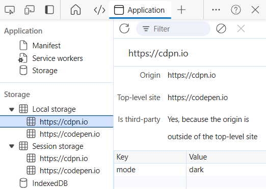
If you want to look more closely at what is going on, you can open up the developer tools in your browser (F12 for Windows, CTRL+ click and select “Inspect” for macOS). From there, go into the “Application” tab and locate https://cdpn.io in the list of items stored in localStorage. You should see the saved key (mode) and the value (dark or light). Then start clicking on the color scheme options again and watch the mode update in real-time.
Accessibility
Congratulations! If you have got this far, you are considering or already providing versions of your website that are more comfortable for different people to use.
For example:
- People with strong floaters in their eyes may prefer to use dark mode.
- People with astigmatism may be able to focus more easily in light mode.
So, providing both versions leaves fewer people straining their eyes to access the content.
Contrast levels
I want to include a small addendum to this provision of a light and dark mode. An easy temptation is to go full monochrome black-on-white or white-on-black. It’s striking and punchy! I get it. But that’s just it — striking and punchy can also trigger migraines for some people who do a lot better with lower contrasts.
Providing high contrast is great for the people who need it. Some visual impairments do make it impossible to focus and get a sharp image, and a high contrast level can help people to better make out the word shapes through a blur. Minimum contrast levels are important and should be exceeded.
Thankfully, alongside other media queries, we can also query prefers-contrast which accepts values for no-preference, more, less, or custom.
In the following example (which uses :has() and color-mix()), a <select> element is displayed to offer contrast settings. When “Low” is selected, a filter of contrast(75%) is placed across the page. When “High” is selected, CanvasText and Canvas are used unmixed for text color and background color:
Adding a quick high and low contrast theme gives your visitors even more choice for their reading comfort. Look at that — now you have three contrast levels in both dark and light modes — six color schemes to choose from!
ARIA-pressed
ARIA stands for Accessible Rich Internet Applications and is designed for adding a bit of extra info where needed to screen readers and other assistive tech.
The words “where needed” do heavy lifting here. It has been said that, like apostrophes, no ARIA is better than bad ARIA. So, best practice is to avoid putting it everywhere. For the most part (with only a few exceptions) native HTML elements are good to go out of the box, especially if you put useful text in your buttons!
The little bit of ARIA I use in this demo is for adding the aria-pressed attribute to the buttons, as unlike a radio group or select element, it’s otherwise unclear to anyone which button is the “active” one, and ARIA helps nicely with this use case. Now a screen reader will announce both its accessible name and whether it is in a pressed or unpressed state along with a button.
Following is an example code snippet with all the ARIA code bolded — yes, suddenly there’s lots more! You may find more elegant (or DRY-er) ways to do this, but showing it this way first makes it more clear to demonstrate what’s happening.
Our buttons have ids, which we have used to target them with some more handy consts at the top. Each time we switch mode, we make the button’s aria-pressed value for the selected mode true, and the other two false:
const html = document.querySelector("html");
const mode = localStorage.getItem("mode");
const lightSwitch = document.querySelector('#lightSwitch');
const darkSwitch = document.querySelector('#darkSwitch');
const autoSwitch = document.querySelector('#autoSwitch');

if (mode === "light") switchLight();
if (mode === "dark") switchDark();

function switchAuto() {
  html.style.setProperty("color-scheme", "light dark");
  localStorage.removeItem("mode");
  lightSwitch.setAttribute("aria-pressed","false");
  darkSwitch.setAttribute("aria-pressed","false");
  autoSwitch.setAttribute("aria-pressed","true");
}

function switchLight() {
  html.style.setProperty("color-scheme", "light");
  localStorage.setItem("mode", "light");
  lightSwitch.setAttribute("aria-pressed","true");
  darkSwitch.setAttribute("aria-pressed","false");
  autoSwitch.setAttribute("aria-pressed","false");
}

function switchDark() {
  html.style.setProperty("color-scheme", "dark");
  localStorage.setItem("mode", "dark");
  lightSwitch.setAttribute("aria-pressed","false");
  darkSwitch.setAttribute("aria-pressed","true");
  autoSwitch.setAttribute("aria-pressed","false");
}
On load, the buttons have a default setting, which is when the “Auto” mode button is active. Should there be any other mode in the localStorage, we pick it up immediately and run either switchLight() or switchDark(), both of which contain the aria-pressed changes relevant to that mode.
<button id="autoSwitch" aria-pressed="true" type="button" onclick="switchAuto()">Auto</button>
<button id="lightSwitch" aria-pressed="false" type="button" onclick="switchLight()">Light</button>
<button id="darkSwitch" aria-pressed="false" type="button" onclick="switchDark()">Dark</button>
The last benefit of aria-pressed is that we can also target it for styling purposes:
button[aria-pressed="true"] {
  background-color: transparent;
  border-width: 2px;
}
Finally, we have a nice little button switcher, with its state clearly shown and announced, that remembers your choice when you come back to it. Done!
Outroduction
Or whatever the opposite of an introduction is…
…don’t let yourself get dragged into the old dark vs light mode argument. Both are good. Both are great! And both modes are now easy to create at once. At the start of your next project, work or hobby, do not give in to fear and pick a side — give both a try, and give in to choice.

Excellent article, congratulations Sara!
I prototyped a tiny demo using the
<fieldset onchange>event and with some JS refactoring, and it works like a charm: https://codepen.io/timotheegoguely/pen/MWNrERoWhether using an
onchangeattribute or attaching event listeners in JavaScript, you can simplify the radio button theme switcher by using one ‘change’ event on the<fieldset>and the same function used for the<select>version:<fieldset onchange="switchMode(event.target.value)">I’m torn about which version to use. Traditionally input elements aren’t supposed to make immediate changes, that would leave the
<button>version as the remaining option, but<select>is such a simple, compact, dare I say elegant choice that I lean toward using it anyway. Plus it has the benefit over buttons of being able to degrade gracefully and still switch modes without JavaScript.I am not sure that GDPR part is correct.
GDPR law has nothing about technology. It tells about personal data. Selected theme is not personal data.
A lot of people confuse GDPR with old “ePrivacy Directive” which prohibited cookie (and was awful designed).
But even for ePrivacy Directive cookie with the same should not be a problem
https://law.stackexchange.com/questions/30739/do-the-gdpr-and-cookie-law-regulations-apply-to-localstorage
I am a “1 in 8 males” who are red-green color deficient (and, unrelated, a programmer). All of the above is interesting news and a good move forward for the light/dark preference of users, but (unless I missed it) doesn’t address color accessibility issues. Just FYI (or a request to be corrected if I did miss something). Thx