This sample text editor showcases the use of TextEditingDeltas and a DeltaTextInputClient to expand and contract styled ranges of text. For more information visit https://api.flutter.dev/flutter/services/TextEditingDelta-class.html.
Screen.Recording.2022-05-05.at.10.42.12.AM.mov
The layer that showcases the TextEditingDelta history in a ListView. These widgets are all unique to this sample
and are unlikely to contain much logic the typical user will need.
An inherited widget that handles the state of the text editing delta history that sits below the input field
in a ListView. This widget contains the list of TextEditingDeltas, and the callback needed to update the list
when a delta is received from the platform, as well as when the framework reports a delta. Deltas
can be reported by the framework when the selection is changed as a result of a gesture such as tapping or dragging,
when the TextEditingValue is updated as a result of a copy/paste, and when the TextEditingValue is updated by an Intent -> Action.
This widget is primarily used to wrap the BasicTextField, so the BasicTextInputClient, which is lower in the tree, can
update the history of TextEditingDeltas as they are reported by the platform and framework.
A widget that represents the content of a TextEditingDelta. A list of TextEditingDeltaViews sits below
the input field showcasing a history of TextEditingDeltas that have occurred on that input field. A
TextEditingDeltaView varies in color depending on the type of TextEditingDelta. TextEditingDeltaInsertions
are green, TextEditingDeltaDeletions are red, TextEditingDeltaReplacements are yellow, and TextEditingDeltaNonTextUpdates are blue.
The layer that handles the styling of the input field, including expanding and contracting the styled ranges based
on the deltas that are received from the platform, and the handling of the state of the styling toggle button toolbar.
This layer contains a mixture of logic unique to this sample and helpful for developers expecting to consume the
TextEditingDelta APIs.
An inherited widget that handles the state of the styling toggle button toolbar that sits on the top
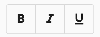
of the input field. This toolbar includes three buttons: Bold, Italic, and Underline. This widget contains
the state of the ToggleButtons, and the callbacks needed to update the state when the selection has changed
or when the toggle buttons have been pressed.
This widget wraps the ToggleButtons so it may access the state of the toggle buttons and update that state
when they have been pressed. It also wraps the BasicTextField, so that the BasicTextInputClient, which is lower
in the tree may access the callback necessary to update the toggle button state when the selection has changed.
A data structure that represents a replacement, with a range, and a generator that produces
the desired InlineSpan. The generator should return a TextSpan with the desired styling, and the
range should be the target range for that styling in the current TextEditingValue. This structure also
contains an expand property which dictates if the replacement should continue to expand from the back edge.
For example say we have "Hello |world|", where "world" is covered by a replacement that bolds the text. If
the expand property is true, typing text at the back edge of "world|" will expand the range and make any text
typed also bold. If it is false then the text typed would not be bold. Additionally, this structure contains
methods to update the replacement for each subclass of TextEditingDelta and a method to remove a section of
the replacement range.
A TextEditingController that manages a list of TextEditingInlineSpanReplacements, that insert custom InlineSpans
in place of matched TextRanges. The controller syncs the replacement ranges based on the type of TextEditingDelta
it receives from the BasicTextInputClient, managing any overlapping ranges accordingly.
This controller also contains convenience methods used by the styling toggle buttons toolbar to un-style certain ranges, disable the expand property of a replacement, and get the common replacements at a selection to determine the current toggle button state.
The layer that defines the appearance of a text input field, handles the text input received from
the platform, and mutations done by the framework through gestures and keyboard shortcuts. These classes begin to
demonstrate the types of logic developers may need if they wish to interact with TextEditingDeltas.
A basic text field that defines the appearance, and the selection gestures of a basic text input client.
These gestures call on methods in RenderEditable to mutate the TextEditingValue through the TextSelectionDelegate,
which, in this case, is a the BasicTextInputClient.
This widget wraps the BasicTextInputClient to define its appearance such as borders, and selection overlay
appearance based on the platform.
A DeltaTextInputClient, a TextInputClient that receives TextEditingDeltas from the platform instead of the
entire TextEditingValue. It is responsible for sending/receiving information from the framework to the platforms text input
plugin, and vice-versa. A list of TextEditingDeltas is received from the platform and can be handled through
the method updateEditingValueWithDeltas. When the framework makes a change to the TextEditingValue, the updated value
is sent through the TextInputConnection.setEditingState method.
A TextSelectionDelegate that handles the manipulation of selection through toolbar or shortcut keys.
An Actions widget is used to handle certain hardware keyboard shortcuts, such as the backspace key to delete text, and
the left and right arrows keys to move the selection.
The RenderObject, RenderEditable (_Editable), is used at the leaf node of the BasicTextInputClient to render the TextSpans given
by the ReplacementTextEditingController.


