[css-inline-3] Naming Stuff #8067
Comments
|
thanks for opening the discussion - there have been concerns about the term
+1 for renaming the that way it would be easier to memorise the value of the normal css behaviour. leading-trim: normal;
text-edge: normal;
line-height: normal;
... |

|
+1 for the value totally agree with @jantimon it fits in much better with the existing values. |
|
A suggestion for an alternative to Example in context: .paragraph {
font-size: 1em;
text-box-sizing: cap;
} |
|
+1 for the Here are some more examples: default:
.paragraph {
  text-box-sizing: normal;
  text-box-trim: normal;
}
cap ✂️:
.paragraph {
  text-box-sizing: cap;
  text-box-trim: both;
}
cap alphabetic ✂️:
.paragraph {
  text-box-sizing: cap alphabetic;
  text-box-trim: both;
} |


|
👍 renaming I have been confused with the term leading here as this trims into the em box, not just the leading. Additionally design software and historical letterpress typesetting often use the term leading in conflicting ways. In my opinion, the term |
|
+1 I think |
|
👍 for I would suggest shortening the property name. For example, having |
|
Ben Holmes proposed to use text-box-trim: none;
text-box-sizing: normal;
|

|
👋 Hi. I want this feature. I was asked to comment. I would probably yield to whatever @scottkellum thinks, he's the real expert. I support the I'd probably down vote Appreciate all the work y'all are doing on this. Thanks! |
|
Thank you for the kind words @davatron5000, lots of experts here but I’m glad my feedback is valuable. Tagging @nicksherman as I know he has thoughts on this that would be valuable to have documented in the thread. |
|
I just want to emphasize that giving them the same prefix makes it easier to introduce a shorthand for them. And those properties are presumably often used together. Sebastian |
|
I strongly support using almost anything other than The |
|
Hi everybody. I’m really looking forward to this feature. Should I dive deeper and make some proposals? I don’t want to bother you. |
|
@jwssnr There are multiple baselines, not just the one you're used to calling "the baseline". I suggest reading through the css-inline spec starting from the top. https://www.w3.org/TR/css-inline-3/#intro |
|
@fantasai Sorry. First let me say this ist my first contribution to such a thing. So maye I do it It the wrong way. Second I have difficulties reading English. So I’m not able to read AND fully understand the specs.
|

|
@jwssnr I appreciate that this is your first time contributing. Might I make a suggestion that you take the spec author at their word, or at least dig into the context they provided. @fantasai has been deeply immersed in this for years and has done outstanding research on this subject. I also understand that English is the language specs are both written and discussed in and that is a barrier to entry that does not provide equitable access to participation. To help visually describe things, there are diagrams that highlight the different baselines needed for different writing systems in the spec: https://www.w3.org/TR/css-inline-3/#css-metrics In your Devangari example, the |
|
Hi. I think I have understood the spec so far on this point. One is the question where the CSS user wants the alignment. I think that's great so far. And I think your work is extremely important and I'm very excited to be able to apply that soon. It's just a matter of the specific names of those lines where the glyphs are aligned. I know, different writing systems use different lines to align the glyphs - hanging, standing, centered ... Literally translated from German to English, we call this writing line. But baseline is a fixed term in type design. No matter what type system, there is always only 1 baseline in the metrics. Even hanging typefaces are designed to work with a baseline, even if it is not visually recognizable. This is also important so to combine different font systems in one text.
I would like it if you could access the established terms in the font metrics via CSS. So I would just call what you guys call There is a second point to add. If I want to trim the space around the text from the top down to baseline in the metric, as I've outlined here, It could well be that I really don't see through it all. If so, I'll shut up from now on and look forward to the result of your work. Thank you so much. 💐 |

I have a very basic understanding of the terms used in typography. Though the specification defines different types of "baselines" for different writing systems. And it defines the word "baseline" as the line along which individual glyphs of text are aligned. According to the spec., the "alphabetic baseline" is used in Latin, Cyrillic, Greek and other scripts, while the "hanging baseline" is used in Tibetan. There is also an "ideographic central baseline" which is halfway between the "ideographic-under baseline" and "ideographic-over baseline". As I understand you, your claim is that the specification misuses term "baseline" as the line used for alignment and "baseline" only refers to the a specific line somewhere at the bottom of the characters. And there is no such thing as an "alphabetic baseline", "hanging baseline" or a "central baseline" in the terminology of typography. Writing systems that use the hanging line to align their characters still have a baseline somewhere at the bottom of the characters. Though that baseline is unrelated to character alignment. Sebastian |
|
Many of these terms are used in the OpenType spec at https://learn.microsoft.com/en-us/typography/opentype/spec/baselinetags. CSS text layout works with OpenType fonts, so the language should reflect that. |
|
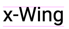
@SebastianZ Yes, that’s almost what I wanted to say. I’m not talking about typographic terms in the sense of their origin, but about the actual terms for in type metrics. These lines are called:
The pink line in the figure above shows the baseline. Font designers design their fonts to align well with other type systems. Of course, it's great if you can also set the alignment to the x-height or cap height. https://www.w3.org/TR/css-inline-3/#baseline-tables The baseline in the digital fonts has its origin in the Latin script — typical for software development. But it is not bound to the Latin script or to "alphabetic". |
|
@faceless2 In Glyphs, for example, there is actually the possibility to set the baseline tags, but this is rarely used. So this info is very rarely available in fonts. Maybe that will change. |
|
The CSS Working Group just discussed
The full IRC log of that discussion<dael> fantasai: This is a long discussion about naming stuff. May come back for more naming. A number of properties in inline spec that are not most understandable. I think that the person who put this on agenda wanted leading-trim and text-edge to be taken.<dael> fantasai: text-box-sizing and text-box-trim have been discussed for text-tedge and leading-trim respectively. Also rename initial values to normal <dael> fantasai: i think it makes sense and we should go in this direction. Not sure we'll end up where b/c some discussion about splitting what is text-edge into two properties. <dael> fantasai: text-edge -> text-box-sizing, leading-trim -> text-box-trim and initial values are normal <dael> fantasai: Though text-box-trim could be none <dael> jensimmons: I think leading-trim initial is normal and text-edge initial is leading. Makes a lot of sense to change that <astearns> +1 to removing ‘leading’ from the list of words we use <dael> jensimmons: text-box-trim is none b/c won't do any extra trimming and then you change to trim <fantasai> text-box-sizing: normal | other stuff <fantasai> text-box-trim: none | other stuff <dael> fantasai: Makes more sense. Going with ^ <dael> jensimmons: Wondering a bit if txt-box-sizing makes the most sense or make sense to text-box-edge. It's really about finding top and bottom edge. Where will you trim to. <dael> fantasai: And we have values for top and bottom independent, right? <dael> jensimmons: I think you can use one value and it's used for both if both in other property or you can list them separately <dael> jensimmons: Are you saying making that two separate properties? <dael> fantasai: No, separate discussion about text-edge. Does 2 things currently, one is change how we measure an inline box to see if it fits in the line-box. Right now include text + half-leading and text-edge lets you cut that down. <dael> fantasai: that's per line box. Effects how text is measured in a paragraph <dael> fantasai: leading-trim we say if you trim start or end and what's top of first line box or bottom of last and that drills down through descendants. In that case we say wehre we trim to and we look at text-edge. astearns raised a question about if we should have a separate prop to let you control that perhaps defaults to text-edge <dael> fantasai: I think what you're proposing is an improvement, we shouldt ake and realize we might come back <fantasai> s/astearns/Alan (from Apple)/ <dael> jensimmons: Hearing what you desc makes me wonder having both properties used. edge when you say which edge and sizing to change calc of box height. That makes sense to me <dael> fantasai: Makes sense <dael> jensimmons: text-box-sizing people like because they know box-sizing. Pointing at lines is different than saying border-box. I don't know what that means for a first step. <dael> jensimmons: Rename to text-box-trim and then text-box-edge for now? Or do we call it sizing for now? <dael> fantasai: Let's go with what you suggested and we can come back once we dig into other issues <dael> jensimmons: text-box-edge or text-box-sizing to start? <dael> fantasai: I don't know. Could go either way <dael> Rossen_: If we start with text-box-edge given it lets you control the 2 edge sep that would be better b/c text-box-sizing is similar to box-sizing and that applies to the whole box. text-box-sizing suggests both would be effected so prefer -edge <dael> fantasai: Makes sense. And we could split into longhands eventually. text-box-edge-start makes more sense <jensimmons> leading-trim: normal; >> text-box-trim: none; AND text-edge >> text-box-edge <dael> fantasai: Don't know we'll need it but good we could go <dael> jensimmons: Talking about this ^ <dael> jensimmons: Portential of text-box-sizing or breaking things out later <tantek> +1 Rossen_'s reasoning on naming. <dael> fantasai: Yeah <dael> jensimmons: sgtm <dael> Rossen_: Feedback or objections? <dael> fantasai: Going in the right direction. Not sure it's at the finish line, but happy to make those edits <dael> jensimmons: sgtm. We have an impl but behind a flag. the name changes are important to get quickly so there won't be old tutorials with wrong names <dael> Rossen_: not hearing objections <dael> RESOLVED: leading-trim: normal; >> text-box-trim: none; AND text-edge >> text-box-edge |
|
I updated my examples on https://github.com/jantimon/text-box-trim-examples
|


|
Edits for renaming Here's one idea: should we rename |
|
Just landed the edits for #8829 (comment) in 7869dc6 and posted a new naming issue to solidify those edits. The proposed syntax is: Have a look at the details in the issue and let us know what you think! |
|
Spec is at https://drafts.csswg.org/css-inline-3/#leading-trim FWIW. |
Just a thread for some bikeshedding:
text-edgeproperty: is this a good name? any better ideas?leadingvalue oftext-edge, should it benormal?half-gap? something else?textvalue oftext-edge, is there a more descriptive word we could use?leading-trimproperty: we have an outstanding resolution to rename totrim-leading, should we do that or something else?inline-sizingproperty: see [css-inline] inline-sizing property name is too similar to inline-size #5189The text was updated successfully, but these errors were encountered: