Fallout's Dev Revealed Origin of Idea Behind Covers of First Two Games. „Nobody at Bethesda Knows About This”
You surely remember the look of the cover art for Fallout and Fallout 2. But do you know how they were created? The developer of the games years later revealed the story behind the two designs.

There are covers that simply stick in your memory. Regardless of whether it's a movie, comic, or video game, some images are absolutely iconic. One of such productions is definitely the first Fallout, which will be recognized even by players who aren't particularly interested in this post-apocalyptic series.
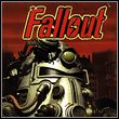
The iconic font and armored hero against a red backdrop with a ruined city in the distance is familiar to all fans of the series, but the cover almost looked completely different.
Is just a helmet on the cover too much?
Turns out, not many people, especially those from Bethesda, know the story behind the creation of both the first and second cover. Timothy Cain, one of the leading creators of Fallout 1 and 2, has been running his own channel on YouTube for some time now, where he shares with fans his thoughts on life, popular culture and, of course, video games and their production.
From time to time, he also publishes materials about the Fallout series, for which he is best known. After the video about the pacifist playthrough of the game, which has survived to this day, it's time to explain to players how the covers for the first two installments were created.
Timothy Cain revealed that the cover of the first Fallout was originally supposed to be completely different. Artists were hired to create it, who presented a design featuring only the game's logo without any characters or distinctive elements.
(...) it was kind of plain, there was nothing about Fallout. It was a generic box cover that could have been used in any post-apocalyptic game.
Timothy Cain
After being disappointed with the cover, the game's art designer Leonard Boyarsky decided to use the designed logotype and combine it with the game's artworks. This is how the characteristic and now iconic cover of the first Fallout was created. The idea was initially not accepted, however.

Although both Cain and Boyarsky were very pleased with the project, the marketing department had a completely opposite opinion. The problem turned out to be the lack of a visible face of the hero, which according to the superior was unacceptable at the time.
(...) Basically, he said "We love what Leon did, but we're not going to use it." And I said, "But why?"
He had host of reasons, but the one I remembered the most was he kept talking about how important it was to have a face on the box. And I said: "We've got a face, it's a man in power armor, very unique, iconic..." And he said, "No, you've got to see the face." Bear in mind that there was not a visible face on the box that the advertising company did; I pointed it out, but he said: "Oh, no, these are the rules."
The entire time we were talking I was staring at something over his shoulder, behind his desk. Eventually, he turned around and looked at it. It was the box of Interplay's best-selling game in 1995 - Descent (...) and there is no face on it (...).
Timothy Cain

Cover of Descent from 1995; Source: YouTube/Timothy Cain
Eventually, Boyarsky's work ended up as the cover, and the series gained its distinctive image.
And this time we need to do the opposite
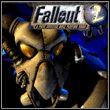
However, this was not the end of the problems. Two years later, while working on Fallout 2, the topic of the box design came up again. As with the first game, Leonard Boyarsky designed a cover that was significantly different from the one we know today.

Original cover of Fallout 2; Source: YouTube/Timothy Cain
The project was supposed to refer to the first part, as well as to the plot of the second installment. As it is already known, it did not happen, and the image seen above ended up only as a loading screen in Fallout 2.
Cain recalls how he found out at a meeting that the game cover had already been chosen and it was completely different than he expected. This time it was the creator himself who advocated for the visible (partially) face, but the management had a different opinion and the decision had already been made.

The studio probably wanted the covers not to be too similar to each other, yet still present a kind of continuity. What do you think about the decisions leading to the cover selection? Do you think the story ended well?


