-
Notifications
You must be signed in to change notification settings - Fork 36
New issue
Have a question about this project? Sign up for a free GitHub account to open an issue and contact its maintainers and the community.
By clicking “Sign up for GitHub”, you agree to our terms of service and privacy statement. We’ll occasionally send you account related emails.
Already on GitHub? Sign in to your account
Update the window UI to look a bit more like Open Quickly #14
base: master
Are you sure you want to change the base?
Conversation
|
It's looking good! I'd definitely add the item separator though. Also, I've also been thinking that it could look interesting to toy around a bit with |
|
Looking awesome! :) |
|
Loving it!
|
|
I'm getting the feature set for a 0.3 release ready, got a couple of things I want to work on but am aiming for later this week. How's the UI work going? |
|
Haven't had much time tonight, but the dynamic heights are already in there (just need to disable the single line mode on the text field in the XIB). I agree with your suggestion about some kind of outline around the key/snippet trigger text. Hopefully I'll have some time tonight to finish that up. |
Conflicts:
	PGXcodeActionBrowser/Controllers/XCActionBarWindowController.m
	PGXcodeActionBrowser/Model/XCCodeSnippetProvider.m


🚨 Please don't merge yet 🚨
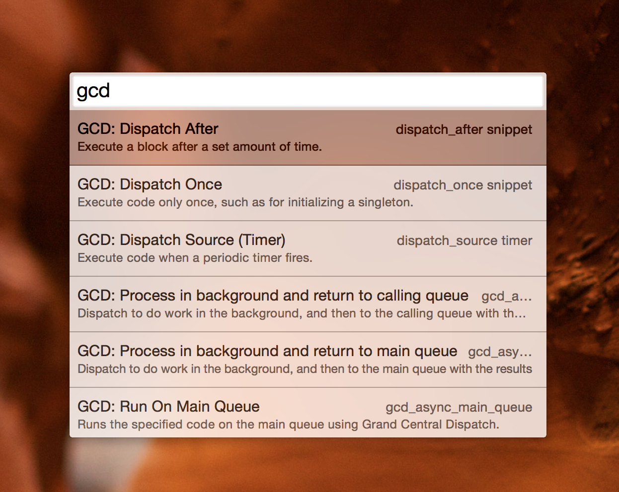
As per the discussion in #9, this is a quick refresh of the UI.
This PR is a WIP, so feedback is appreciated. It's also missing some spacing, separators, icons and font treatments.