Skip to content
New issue

Have a question about this project? Sign up for a free GitHub account to open an issue and contact its maintainers and the community.

By clicking “Sign up for GitHub”, you agree to our terms of service and privacy statement. We’ll occasionally send you account related emails.

Already on GitHub? Sign in to your account

Update extension icon with a better look and style with Raycast stand… #19

Merged
merged 3 commits into from
Sep 24, 2022

Conversation

raffeyang
Copy link
Contributor

之前的图标看起来偏大,我优化了一下,让图标看起来和Raycast默认图标,以及macOS图标一样大,优化前后效果对比如下:

CleanShot 2022-09-24 at 00 35 33@2x

CleanShot 2022-09-24 at 00 36 49@2x

Copy link

@github-actions github-actions bot left a comment

Choose a reason for hiding this comment

The reason will be displayed to describe this comment to others. Learn more.

Thank you for your first PR contribution! Jax0rz

@tisfeng
Copy link
Owner

tisfeng commented Sep 24, 2022

感谢你的 PR, 其实之前我也注意到了这一点,但是一来由于不知道该调整的具体尺寸,二是 Raycast 的 Quicklink 图标也挺大的,这个没办法调整,所以无论如何总归是割裂,那还不如保持原样。 但既然官方接受了你 PR raycast/extensions#2925 ,那就调整吧。

不过 Eudic Dictionary.png 不用调整,这个是扩展内部 Eudic 的图标。

@tisfeng
Copy link
Owner

tisfeng commented Sep 24, 2022

或者你可以帮忙把所有的图标都调整一下,这样便于管理,也样式统一。

@raffeyang
Copy link
Contributor Author

raffeyang commented Sep 24, 2022

或者你可以帮忙把所有的图标都调整一下,这样便于管理,也样式统一。

全部图标都更新了,作者看一下,我本地运行看了下效果,更新后的图标和raycast默认图标以及搜索已安装好的应用的图标基本一样大了。然后之前圆角尺寸不一样大的图标,比如百度和音量的图标等,我也统一优化了。

@tisfeng
Copy link
Owner

tisfeng commented Sep 24, 2022

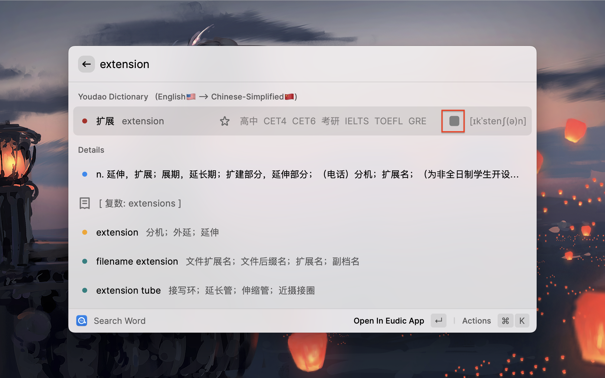
好的,非常感谢! 我看了一下,效果不错,不过有个小问题,之前播放声音的图标是支持透明通道,也就是适配了浅色和深色模式的,这个如果不方便调整的话,可以不用改。

easydict 2022-09-24 at 21 58 52

@raffeyang
Copy link
Contributor Author

好的,非常感谢! 我看了一下,效果不错,不过有个小问题,之前播放声音的图标是支持透明通道,也就是适配了浅色和深色模式的,这个如果不方便调整的话,可以不用改。

easydict 2022-09-24 at 21 58 52

我改一下

@tisfeng
Copy link
Owner

tisfeng commented Sep 24, 2022

Ok

@tisfeng tisfeng merged commit ad40a1f into tisfeng:main Sep 24, 2022
Sign up for free to join this conversation on GitHub. Already have an account? Sign in to comment
Labels
None yet
2 participants