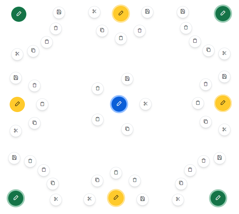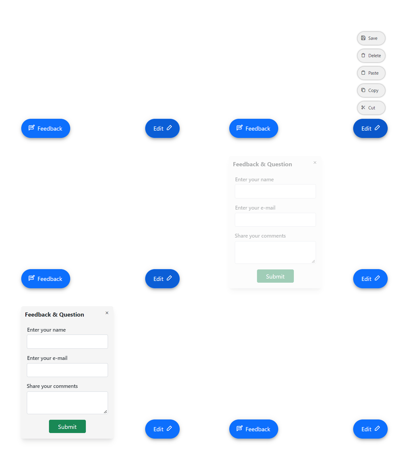


The React Speed Dial component is an extension of the React Floating Action Button that displays a list of action buttons when clicked. It displays action buttons in linear and radial directions.

The React Speed Dial component supports the display of action items in a linear or radial layout. This helps make actions more accessible and easy to use.
In the linear mode, the React Speed Dial component displays action items in a list-like format, either horizontally or vertically. Action items can be displayed at the top, bottom, left, or right side of the Speed Dial button. Auto positioning displays the action items based on the position of the Speed Dial.


In the radial mode, the React Speed Dial component displays action items in a circular pattern similar to a radial menu. If start and end angles are not specified, they are automatically calculated based on the position of the component.
Several predefined styles are available in React Speed Dial:


Place the Speed Dial button in various built-in positions on the target element or page.
The React Speed Dial component enables customization of the Speed Dial button and action items, including the use of text only, icon with text, or icon only. This allows developers to create highly personalized buttons and action items that effectively communicate the actions they perform.
![]()

Customize the default appearance of the Speed Dial and its action items. By using item and popup templates, a highly personalized Speed Dial can be created, which enhances the user experience.
Modal popup mode enables an overlay to prevent background interaction when popup action items are opened.

The React Speed Dial supports these built-in themes: Tailwind CSS, Bootstrap 5, Bootstrap 4, Bootstrap, Material, Fabric, Fluent, and high contrast. Users can customize one of these built-in themes or create new themes to achieve their desired look and feel by simply overriding SASS variables or using our Theme Studio application.
The React Speed Dial component offers APIs for customizing its appearance and behavior, as well as templates for personalizing the look and feel of the Speed Dial and its action items. With these APIs, developers can create a unique and highly personalized Speed Dial that fits seamlessly into their applications.
Easily get started with the React Speed Dial using a few simple lines of TSX code example as demonstrated below. Also explore our React Speed Dial Example that shows you how to render and configure the React Speed Dial.
{ /* Import the Speed Dial */ }
import { SpeedDialComponent, SpeedDialItemModel } from '@syncfusion/ej2-react-buttons';
import * as React from 'react';
import './App.css';

public items: SpeedDialItemModel[] = [
    { iconCss:'e-icons e-cut' },
    { iconCss:'e-icons e-copy' },
    { iconCss:'e-icons e-paste' }
]

{ /* To render Speed Dial */ }
export default class App extends React.Component {
    render() {
        return (<SpeedDialComponent  openIconCss='e-icons e-edit' items={this.items}></SpeedDialComponent >);
    }
}The Speed Dial component is also available in Blazor, Angular, Vue, and JavaScript frameworks. Check out the component on other platforms using these links:
The Speed Dial in React Syncfusion provides the following features:
We do not sell the React Speed Dial separately. It is only available for purchase as part of the Syncfusion team license. This contains over 1,800 components and frameworks, including the React Speed Dial. The price of the team license starts at $395 per month for 5 developers, and includes support and updates until the subscription expires. In addition, we might offer discounts based on currently active promotions. Please contact our product specialists today to see if you qualify for any additional discounts.
You can find our React Speed Dial demo, which demonstrates how to render and configure the Speed Dial.
No, our 1,800+ components and frameworks for web, mobile, and desktop, including our React Speed Dial, are not sold individually. They are only available as part of a team license. However, we have competitively priced the product, so it only costs a little bit more than what some other vendors charge for their Speed Dial component alone. We have also found that, in our experience, our customers usually start off using one of our products and then expand to several products quickly, so we felt it was best to offer all 1,800+ components and frameworks for a subscription fee that starts at $395 per month for a team of 5 developers. Additionally, we might be able to offer discounts based on currently active promotions. Please contact our product specialists today to see if you qualify for any additional discounts.
No, this is a commercial product and requires a paid license. However, a free community license is also available for companies and individuals whose organizations have less than $1 million USD in annual gross revenue, 5 or fewer developers, and 10 or fewer total employees.
A good place to start would be our comprehensive getting started documentation.


 Documentation
Greatness—it’s one thing to say you have it, but it means more when others recognize it. Syncfusion is proud to hold the following industry awards.