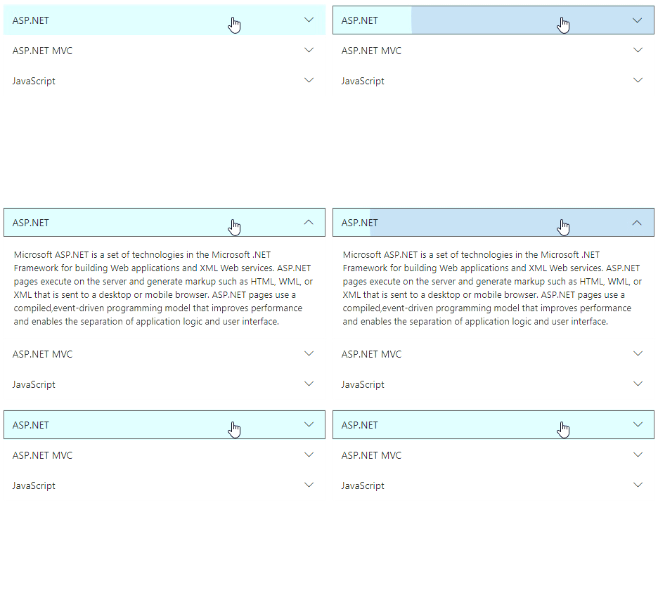


The ASP.NET Core Accordion is a container-based control with vertically collapsible panels (vertical accordion) and stacked headers that expand or collapse one or more panels at a time within the available space.
The ASP.NET Core Accordion control allows you to customize the expand and collapse actions.
A single panel or multiple panels can expand or collapse (panel toggle) at a time by clicking the panel header (interactions) or programmatically.
Collapse all the panels at once. With customization options, a specific panel is set to be in an open state while the rest of the panels are collapsed.
The ASP.NET Core Accordion control allows you to customize the header and content panel appearance using given HTML elements.

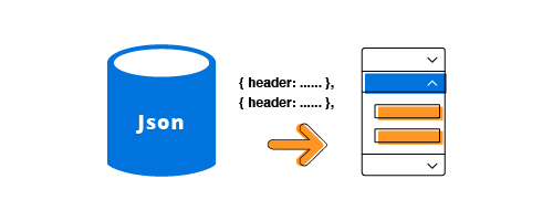
The ASP.NET Core Accordion control can be rendered based on a JSON array collection of properties such as headers and content. Data binding can be achieved by an array collection of items.
Add nested levels of the collapsible panel within the parent accordion.
The ASP.NET Core Accordion control can use a nested vertical (hierarchical) navigation menu with links, including external links, in the accordion header.
Add prefix icons or images to the panel header. The default expand and collapse icon used in the header is customizable.

The ASP.NET Core Accordion control adapts responsively in devices based on the available space for modern web and mobile applications.
The ASP.NET Core Accordion allows you to load external content dynamically to a panel using the AJAX library.


ASP.NET Core collapsible panels support several types of built-in fancy animation for panel expanding and collapsing actions. Animation behavior is customizable.
Developers can control the appearance and behavior of accordions using a rich set of APIs.
During browser navigation, the expanded or collapsed state of an accordion persists.
The ASP.NET Core Accordion control is shipped with several built-in themes such as Material, Bootstrap, Fabric (Office 365), Tailwind CSS, and High Contrast.
Users can customize any one of these built-in themes or create new themes by either simply overriding SASS variables or using our Theme Studio application.
Accordion is also available in Blazor, Angular, React, Vue, and JavaScript frameworks. Check out the different Accordion platforms from the links below,


 Documentation
Greatness—it’s one thing to say you have it, but it means more when others recognize it. Syncfusion is proud to hold the following industry awards.