

The ASP.NET Core Tabs control is a simple user interface (tabs UI) for organizing related content and occupying a compact space. The tabs are aligned horizontally, and each tab is associated with its header. One of the tabs must always be selected and visible. The Tabs control has a rich set of features such as animation, orientation, templating, header styles, a close button for each tab, a scrollbar or pop-up when there are many tabs, JSON support, and more.
The ASP.NET Core Tabs control manages additional tabs efficiently using scrollable tabs when there are a greater number of tabs than can be shown. This simplifies the design and aligns the tabs in a single line. Users can swipe left or right over the tab header area to scroll and make clearly visible the out-of-sight tabs in mobile.
The pop-up mode is another type of overflow mode in which a pop-up holds the additional tabs when there are a greater number of tabs than can be shown. You can view the out-of-sight tabs by exploring the pop-up mode.
Users can nest one tab within another tab to design a complex layout.
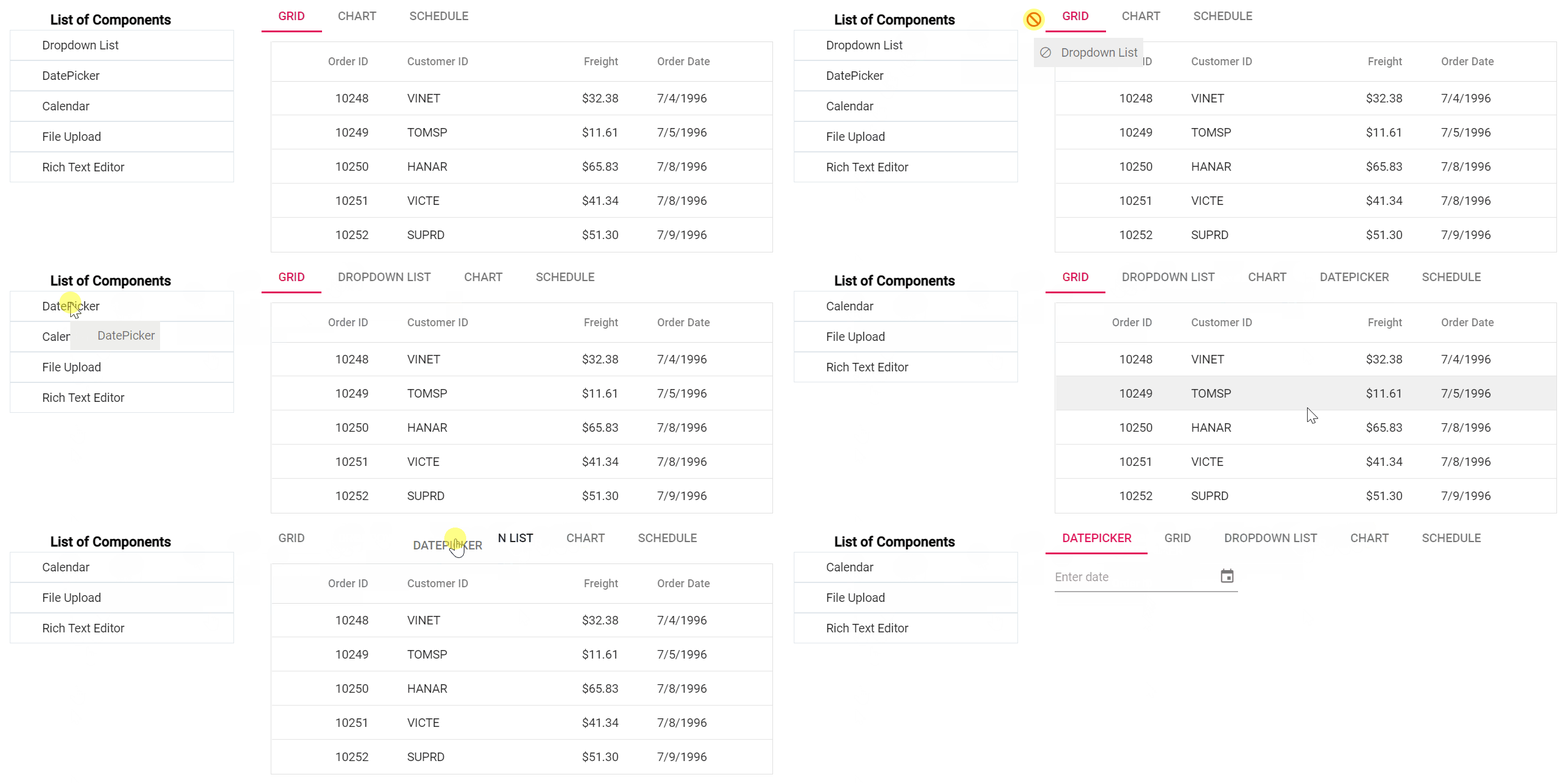
The ASP NET Core Tabs control allows users to drag and drop tabs to easily re-prioritize the tab item order. Also, it allows adding tabs dynamically from an external source such as a ListView, TreeView, etc.

The tab bar has a good visual representation for segregating active tabs and inactive tabs. It has an enormous interaction area for navigation in mobile tab view. The tab headers can be icons, plain text, or both. The position of the icons can also be changed to the left, right, top, and bottom inside tab headers.
A row of tabs can be aligned horizontally on the top or bottom of tab content to make a top-to-bottom or bottom-to-top hierarchy in a tab bar.
The ASP.NET Core Tabs control provides various built-in styles to customize the headers easily.
Users can configure the Remove button for each tab or specific tabs to remove it dynamically.
Navigate among tabs with nice, built-in animation effects (for example: slide animation) when you click or tap a tab. The tab navigation happens on swiping within the content or tapping a tab header in a mobile tab view.

Users can dynamically load the content to the tab pane on activating it. They can also load the content from external pages using the AJAX library.
Users can adjust a tab’s height automatically according to its content, parent container, or the height of the highest tab panel.
It’s easy to integrate other ASP.NET Core controls as content of the tab’s pane. The ASP.NET Core Tabs control can also be integrated with other controls such as Dialog and Card.
The easy-to-use ASP.NET Core Tabs control design forms wizard-like applications that are used to perform multi step processes.
The ASP.NET Core Tabs control has several built-in themes such as material, bootstrap, fabric (Office 365), and high contrast. They help to design material tabs, bootstrap tabs, etc. The users can customize any one of these built-in themes or create new themes to achieve their own desired look and feel, either by simply overriding SASS variables or using our Theme Studio application.
Tabs is also available in Blazor, Angular, React, Vue, and JavaScript frameworks. Check out the different Tabs platforms from the links below,
Developers can control the appearance and behavior of the Tabs control using a rich set of APIs, such as those for adding a new tab or removing a tab.


 Documentation
Greatness—it’s one thing to say you have it, but it means more when others recognize it. Syncfusion is proud to hold the following industry awards.