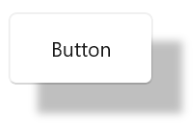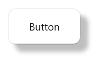


The .NET WinUI Shadow control is used to apply shadow effects to framework elements to give them an appearance of depth, allowing users to easily differentiate overlapping elements and enjoy a beautiful and appealing user interface.

Apply a shadow to shapes, paths, images, and any type of framework element.

Apply a shadow effect to any shape of an image, including squares, circles, and other irregular shapes.

Apply a shadow effect to any type of path or shape.
A shadow effect can be customized as follows.

Customize the color of the shadow.

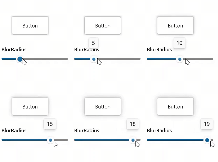
Customize the blur level of the shadow.

Customize the position of the shadow relative to the position of the view.

Customize the corner radius of the shadow.
Easily get started with the WinUI Shadow using a few simple lines of XAML and CS code example as demonstrated below. Also explore our WinUI Shadow Example that shows you how to apply shadow effects for controls in WinUI.
<Page
    x:Class="GettingStarted.MainPage"
    xmlns="http://schemas.microsoft.com/winfx/2006/xaml/presentation"
    xmlns:x="http://schemas.microsoft.com/winfx/2006/xaml"
    xmlns:local="using:GettingStarted"
    xmlns:d="http://schemas.microsoft.com/expression/blend/2008"
    xmlns:mc="http://schemas.openxmlformats.org/markup-compatibility/2006"
    xmlns:syncfusion="using:Syncfusion.UI.Xaml.Core"
    mc:Ignorable="d"
    Background="{ThemeResource ApplicationPageBackgroundThemeBrush}">
    <Grid>
      <syncfusion:SfShadow>
         <Button Height="50" Width="100" Content="Button"/>
      </syncfusion:SfShadow>
    </Grid>
</Page>
// Creating an instance of the Shadow control.
SfShadow shadow = new SfShadow();
// Setting the SfShadow content value.
Button button = new Button();
button.Height = 50;
button.Width = 100;
button.Content = "Button";
shadow.Content = button;

Greatness—it’s one thing to say you have it, but it means more when others recognize it. Syncfusion is proud to hold the following industry awards.