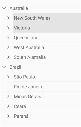


The TreeView control for Xamarin is a hierarchical listview representing hierarchical data in a tree like structure with expand and collapse node options. The control provides an optimized reuse strategy, smooth scrolling experience, and virtualization. In addition, illustrating office hierarchy, organizational structure, or nested relationships in an application can be done easily. It enhances performance with features like data binding, unbound node population, template selector, selection with different selection modes, complete UI customization, and commands for MVVM.
The TreeView control supports both ItemsSource binding and unbound mode nodes population. Easily customize the TreeView control as a navigation control by populating the unbound mode nodes. This layout can be easily defined in the XAML. In addition, you can use all the necessary properties and commands of Xamarin.Forms TreeView in the MVVM approach.

TreeView has a load-on-demand option that allows you to load huge amounts of data by dynamically loading the indicator, which improves the control’s performance.

The TreeView control allows you to customize an entire tree node by hosting any image or custom view using a template. The control supports customizing each node (both parent and child nodes) by dynamic selection of the UI using a data template selector.


Add check boxes to each tree node and check or clear the corresponding node.


The TreeView control provides a customizable expander UI, including size customization, for creating an elegant look and feel.

Easily customize the item height for the Xamarin.Forms TreeView control.

Specify the required indentation space for child nodes in the Xamarin.Forms TreeView control.
The TreeView control provides animation support when expanding or collapsing the tree view nodes. The animation behavior is customizable.

Auto size the tree node height based on the node’s content to enhance content readability. Additionally, we can also set the height of the tree node to one level or one node conditionally.

TreeView supports to change the flow direction of the text from right to left.

Easily get started with the Xamarin TreeView using a few simple lines of C# code as demonstrated below. Also explore our Xamarin TreeView Example that shows you how to render and configure the Xamarin TreeView.
<Grid>
<syncfusion:SfTreeView x:Name="treeView" />
</Grid>
using Syncfusion.XForms.TreeView;
namespace XamarinTreeView
{
public class MainPage : ContentPage
{
public MainPage()
{
SfTreeView treeView = new SfTreeView();
Root_Grid.Children.Add(treeView );
}
}
}The Syncfusion Xamarin TreeView provides the following:
You can find our Xamarin TreeView demo here.
No, this is a commercial product and requires a paid license. However, a free community license is also available for companies and individuals whose organizations have less than $1 million USD in annual gross revenue, 5 or fewer developers, and 10 or fewer total employees.
A good place to start would be our comprehensive getting started documentation.


 Documentation
Greatness—it’s one thing to say you have it, but it means more when others recognize it. Syncfusion is proud to hold the following industry awards.