

The .NET MAUI ComboBox control is a selection component that allows users to type a value or choose an option from a list of predefined options. It has many features, such as data binding, editing, searching, and button customization.
Easily get started with the .NET MAUI ComboBox using a few simple lines of XAML code example as demonstrated below. Also explore our .NET MAUI ComboBox Example that shows you how to render and configure the .NET MAUI ComboBox.
<?xml version="1.0" encoding="utf-8" ?>
<ContentPage xmlns="http://schemas.microsoft.com/dotnet/2021/maui"
             xmlns:x="http://schemas.microsoft.com/winfx/2009/xaml"
             xmlns:editors="clr-namespace:Syncfusion.Maui.Inputs;assembly=Syncfusion.Maui.Inputs"
             xmlns:local="clr-namespace:ComboBoxSample"
             x:Class="ComboBoxSample.MainPage">
    <ContentPage.BindingContext>
      <local:SocialMediaViewModel />
    </ContentPage.BindingContext>
    <ContentPage.Content>
        <editors:SfComboBox x:Name="comboBox"
             WidthRequest="250"
             DisplayMemberPath = "Name"
             ItemsSource="{Binding SocialMedias}" />
    </ContentPage.Content>
</ContentPage>Select a single item from the suggestion list based on the entered text.

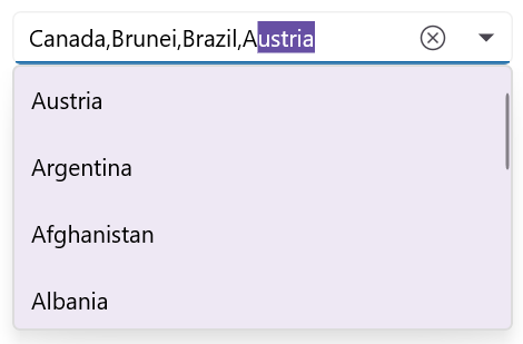
Select multiple items from the .NET MAUI ComboBox suggestion list and display the selected items either as tokens, such as in an email address bar, or text separated by a delimiter.

Customizable token representation in the .NET MAUI ComboBox control allows users to remove an item with its close button.

Delimit the selected items with characters such as ‘$’ for dollar-sign separation or ‘,’ for traditional comma separation.
The ComboBox control supports editable and non-editable modes to choose items.

Edit the text in a text box. Suggestions will be shown in the dropdown list based on the input.

Items can be selected from the dropdown list, but the selected items cannot be edited.
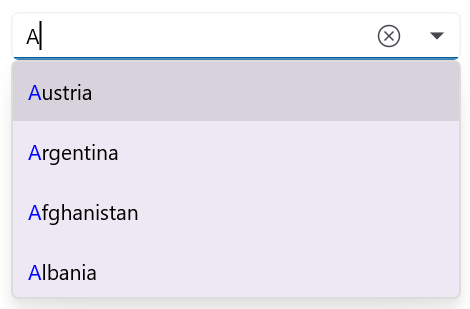
The first item that fits the user input is highlighted in the dropdown list. Highlighting matching text in the ComboBox dropdown list makes it easy for users to identify and select the items they are looking for at a glance.

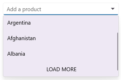
With on-demand loading, if there are more filtered items than can be viewed, they won’t be populated. Instead, users can click the Load More button when they need more items.

The .NET MAUI ComboBox control starts offering matches as soon as users start typing, but supports a provision to set the number of characters required to start matching.
The control dynamically extends its layout based on the input content.


Display hints using placeholder text when no item is selected. A well-designed placeholder provides context and makes the control more intuitive.
Data-binding support works for all popular data sources and displays data based on the display member path. It automatically generates items from a data-bound collection. The application can be designed in the MVVM pattern.


Users can set the desired text to be displayed when the entered text is not in the suggestion list of .NET MAUI ComboBox.

Adjust the dropdown height based on the number of items to improve readability without scrolling. This enhances the user interface design and user experience.

Dropdown list items can be customized with an image or custom control. This enhances the user experience and provides a more tailored and user-friendly application.
![]()
Users can adjust the width and height of the ComboBox’s dropdown button to match their design needs.
Highlights matching characters in a suggestion list to make it easy to pick an item.

Highlights the first position of the matching characters in the suggestion list.

Highlights the matching characters present in the dropdown list when the TextSearchMode is set to “Contains”.
The Syncfusion .NET MAUI ComboBox control supports the following features:
You can find our .NET MAUI ComboBox demo here. It demonstrates how to render and configure the ComboBox control.
No, this is a commercial product and requires a paid license. However, a free community license is also available for companies and individuals whose organizations have less than $1 million USD in annual gross revenue, 5 or fewer developers, and 10 or fewer total employees.
A good place to start would be our comprehensive getting started documentation.


Greatness—it’s one thing to say you have it, but it means more when others recognize it. Syncfusion is proud to hold the following industry awards.